- Client challenge
- Jumpe needed an identity with the energy of athletic performance without looking like generic fitness branding. It also had to stay legible on apparel and small digital formats.
- Strategic idea
- Turn forward motion into a disciplined visual language: a kinetic wordmark, a sharp orange signal, and a system that always feels active.
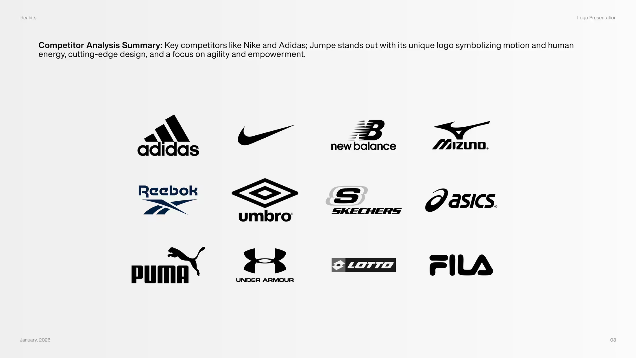
- Previous identity
- The launch needed one recognisable identity rather than separate visual decisions for apparel, presentations, and social content.
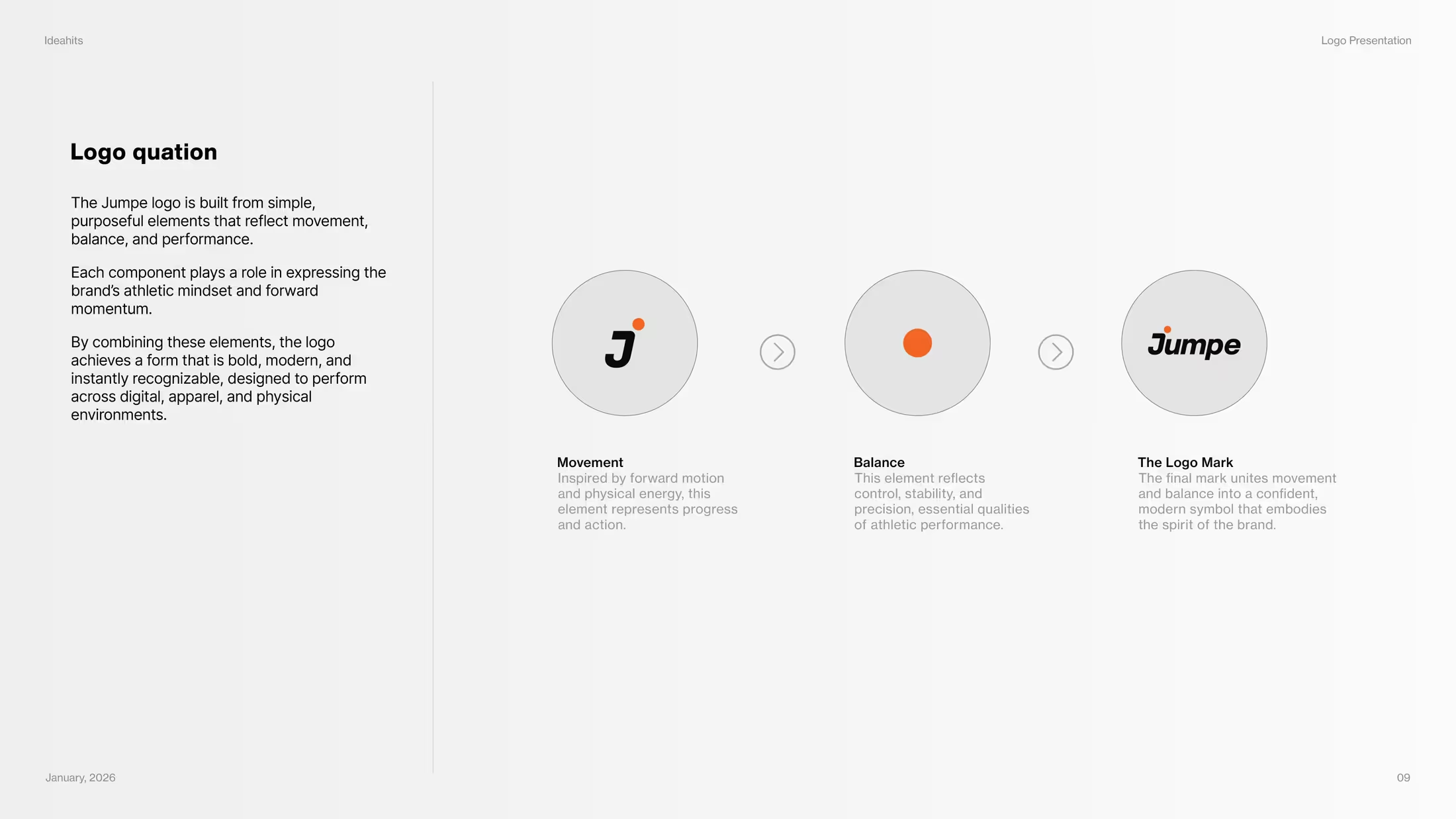
- Logo development
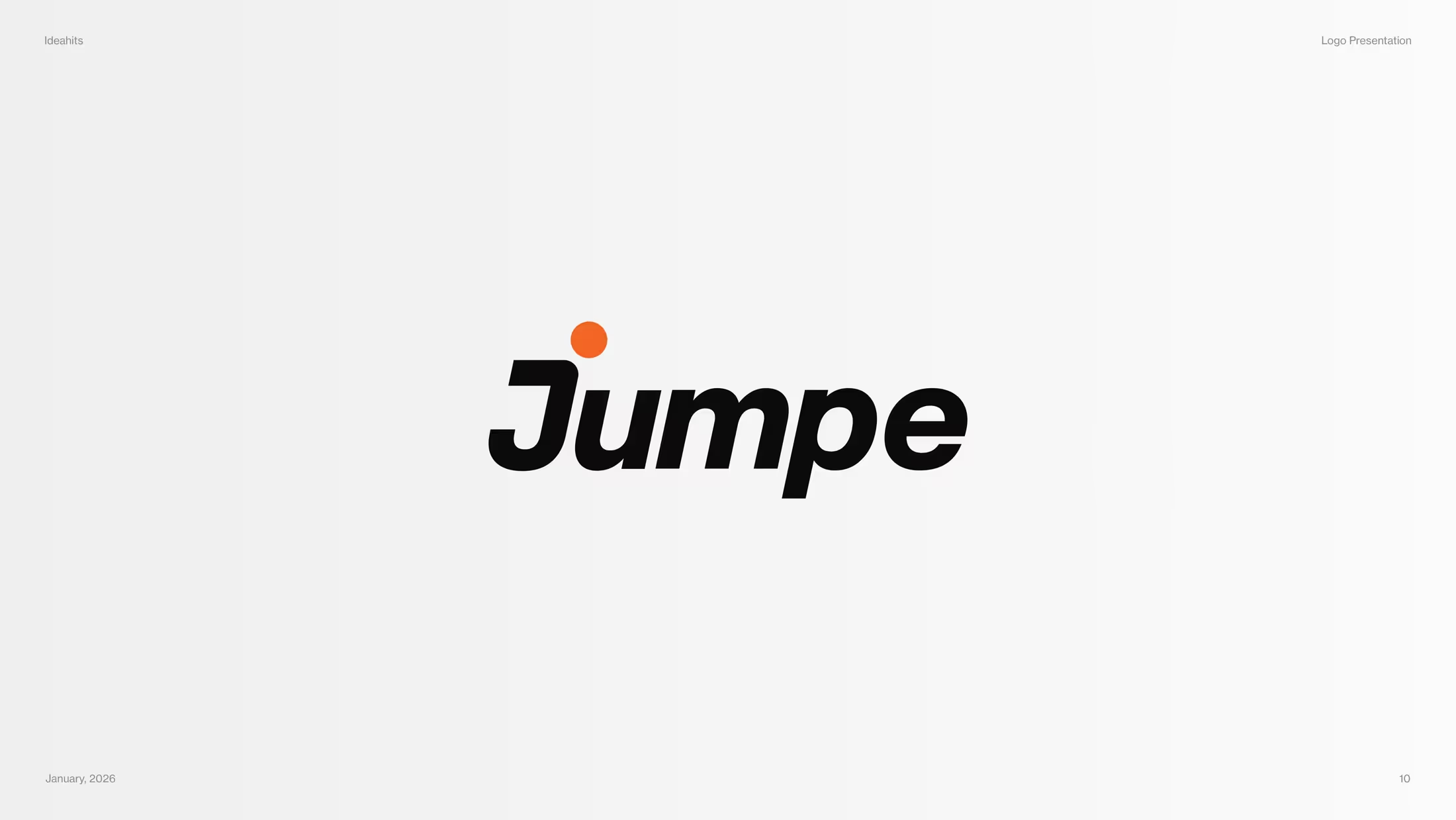
- The wordmark was refined for pace, balance, and small-size clarity, then tested in primary, compact, and single-colour use.
- Complete system
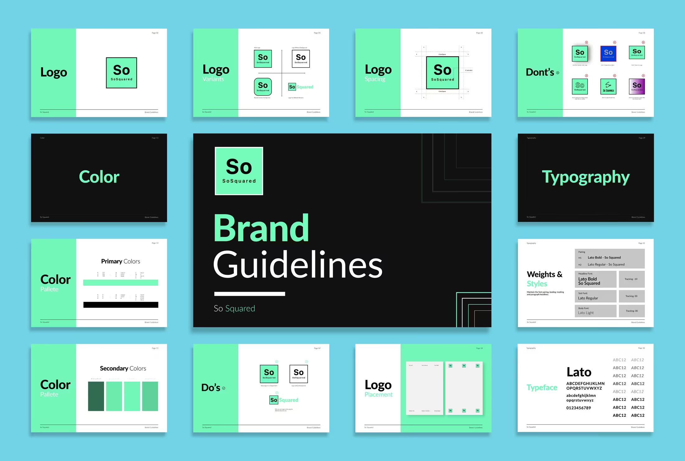
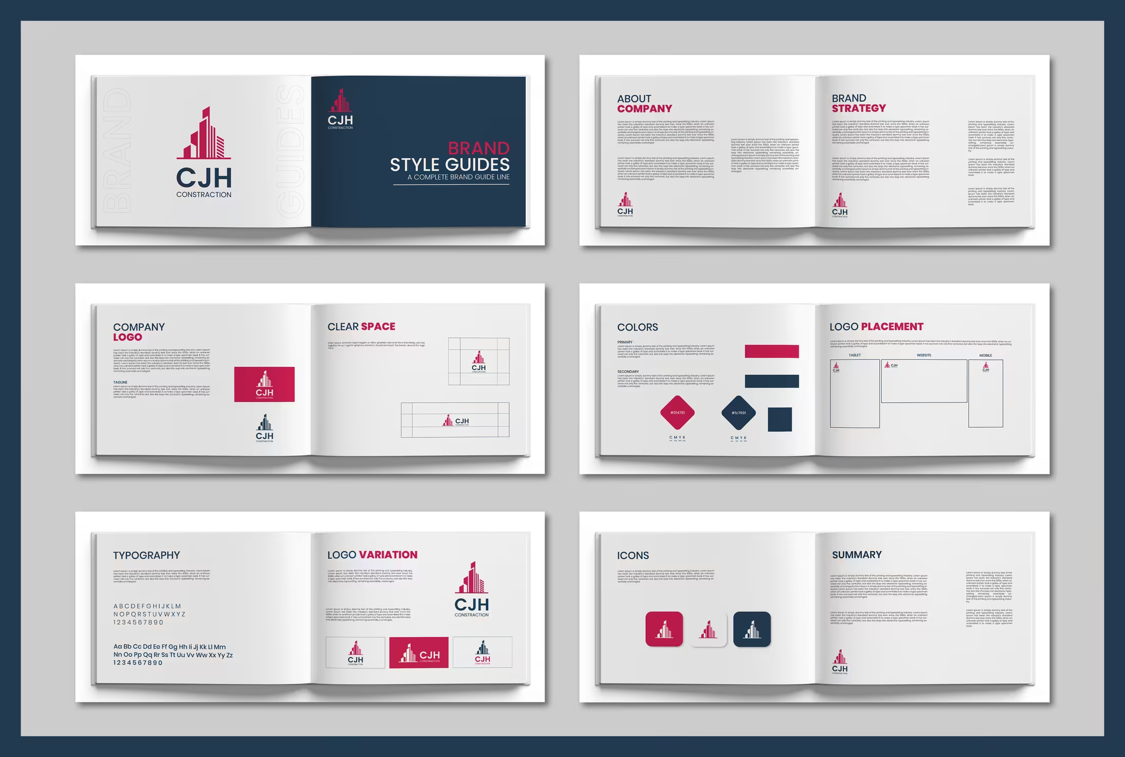
- Logo construction, an orange-black-neutral palette, typography, layout behaviour, and presentation rules.
- Real-world applications
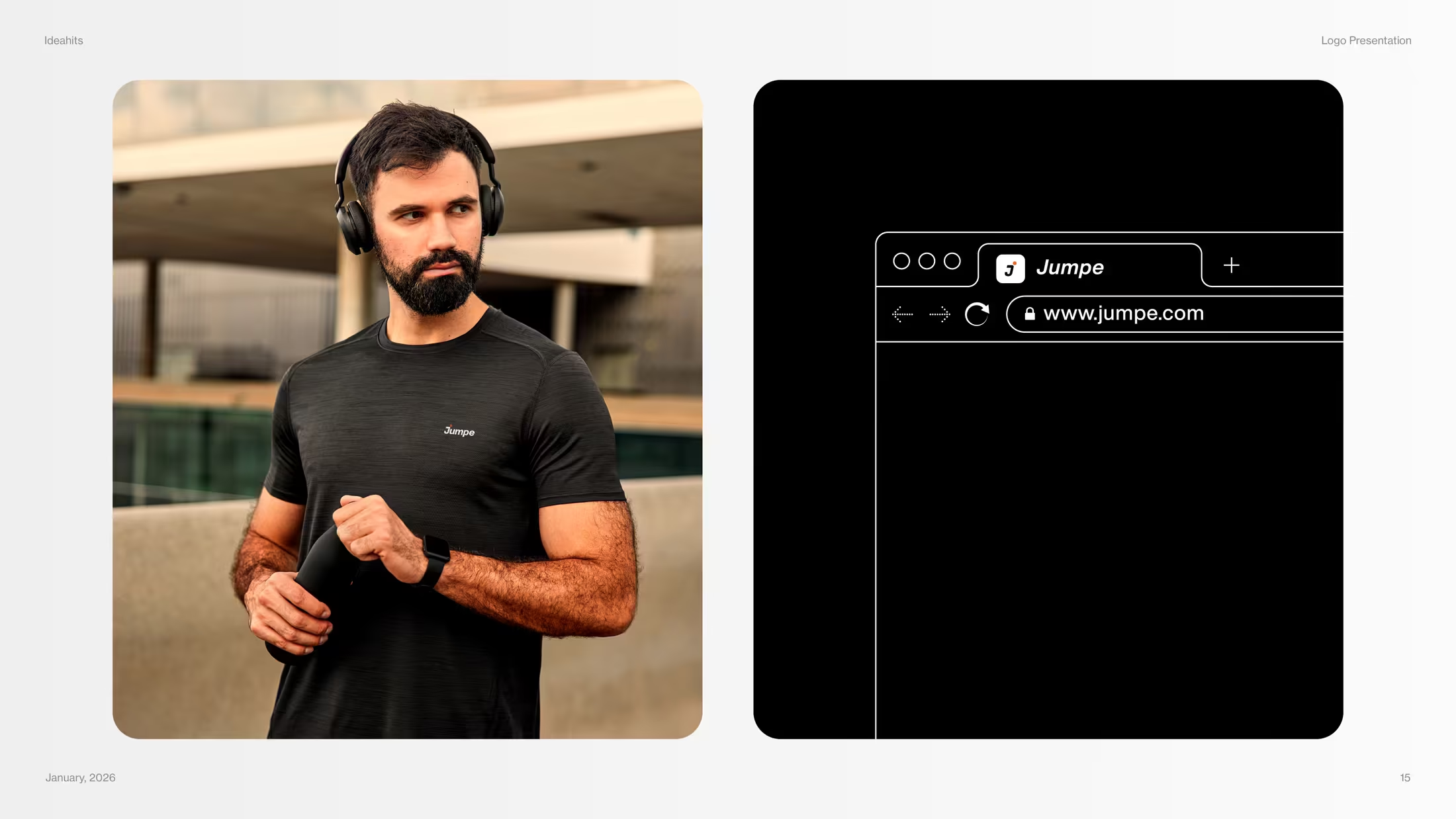
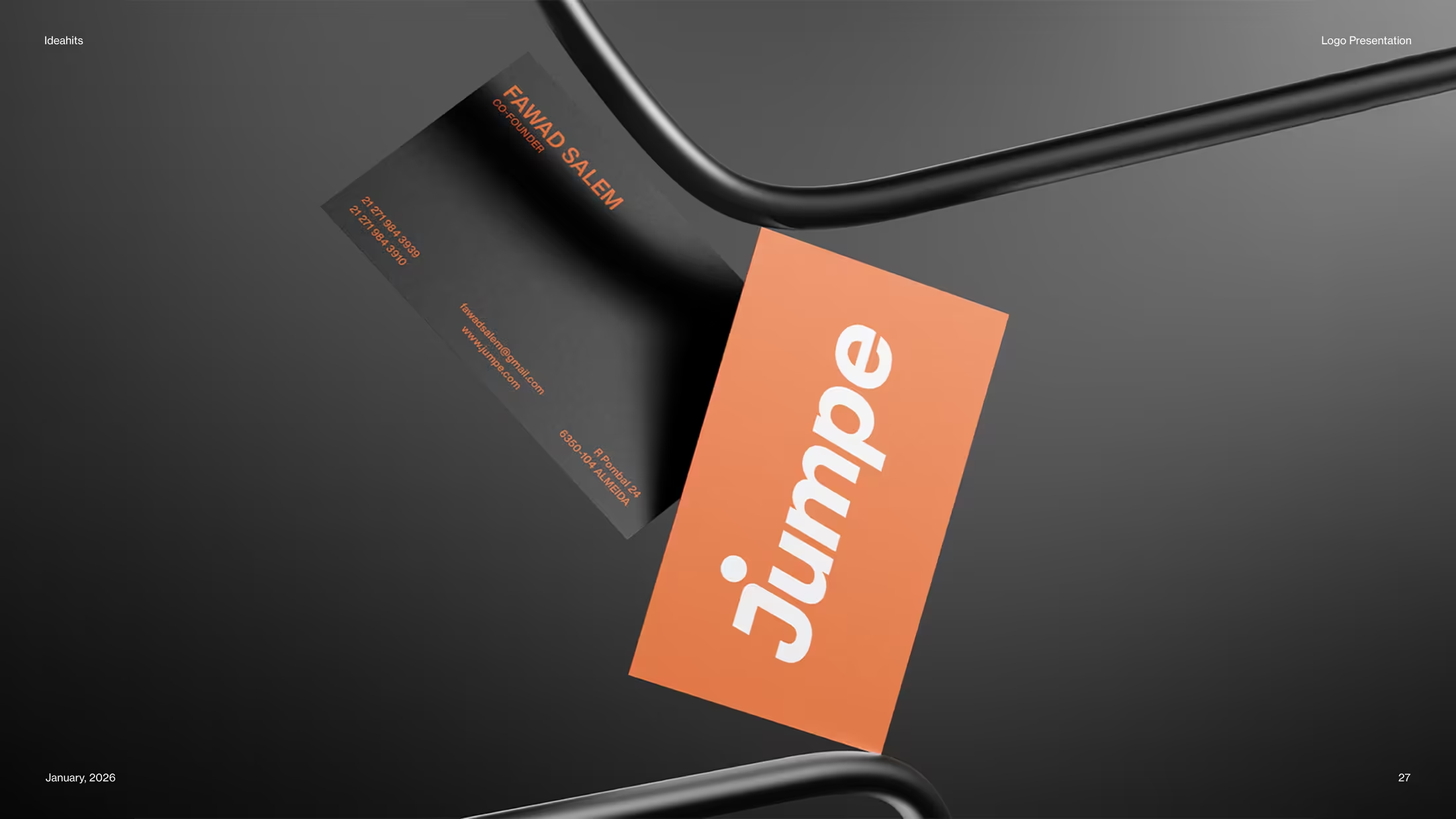
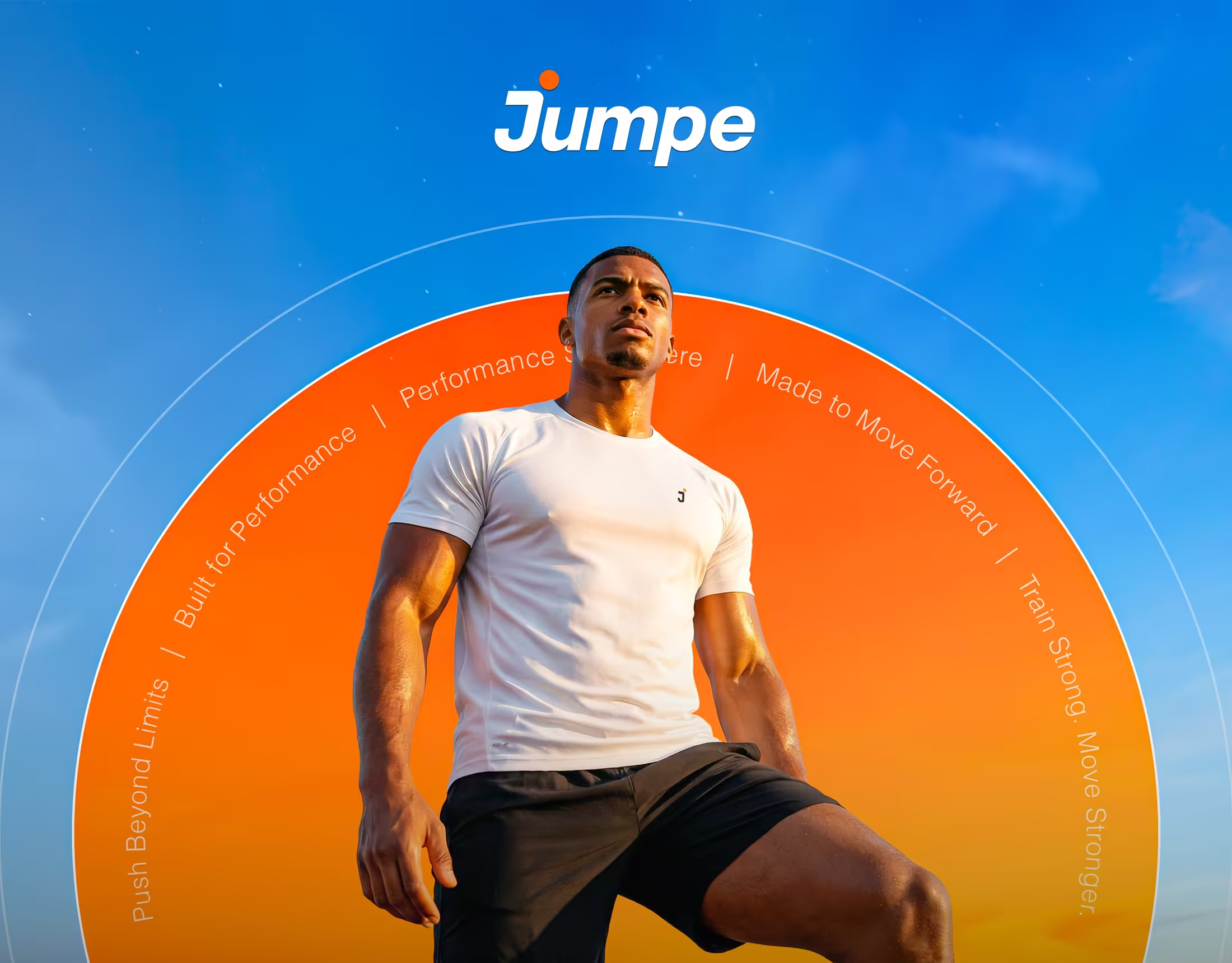
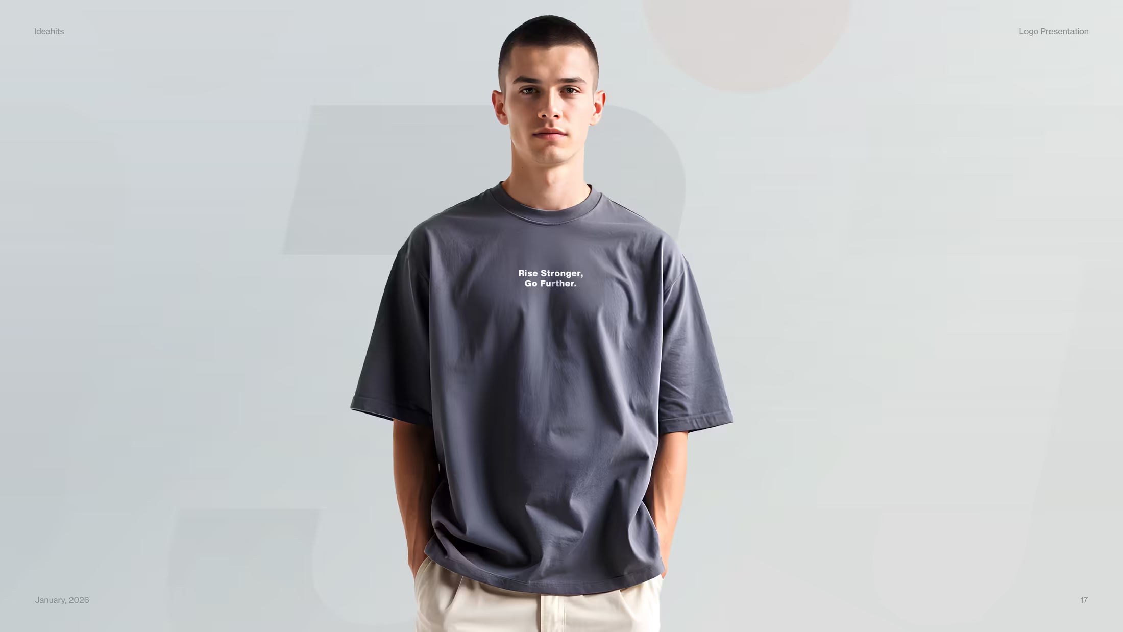
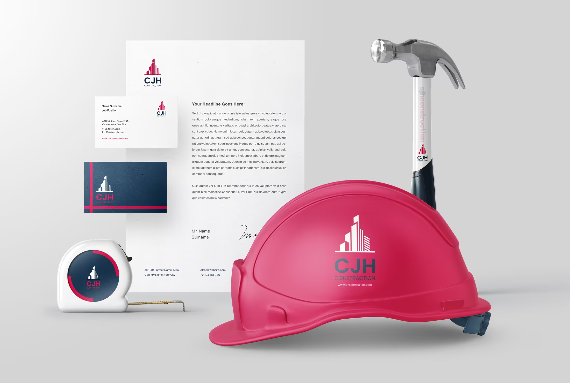
- Performance apparel, digital profiles, launch graphics, presentation decks, and campaign-ready compositions.
- Result
- A complete identity direction that holds together across digital, print, apparel, and future brand extensions.
- Deliverables
- Logo and mark system, Apparel applications, Presentation deck, Digital and print rollout.