CJH Construction
A construction brand built to command trust on site, win in proposals, and hold up across every printed and digital touchpoint.
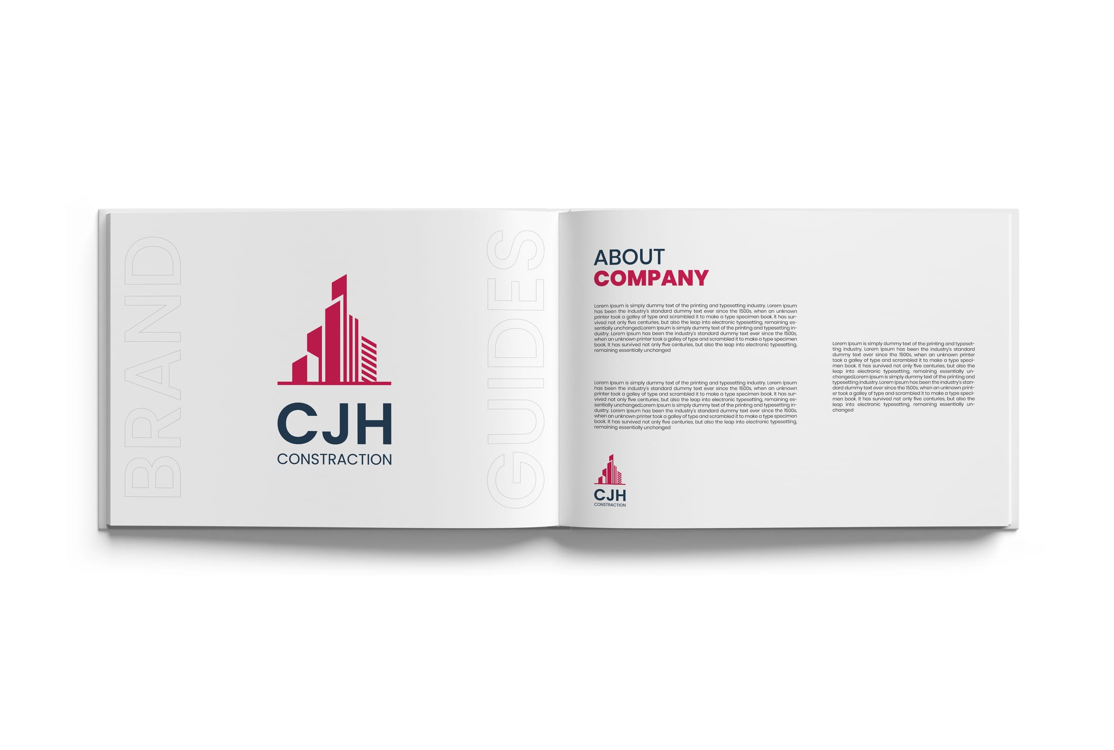
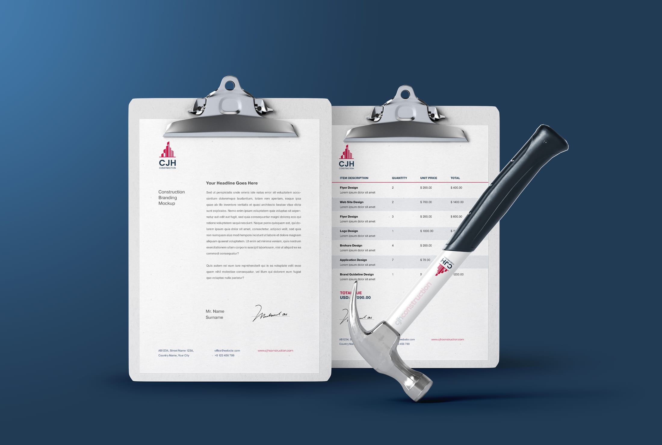
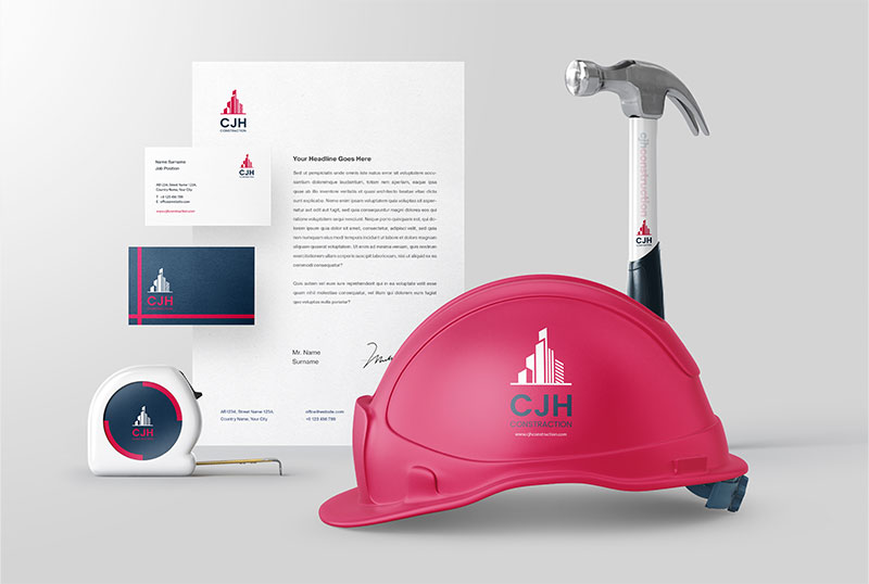
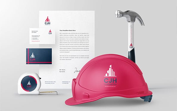
CJH needed an identity that could do two jobs at once: look polished in client proposals and feel dependable on the physical job site. That meant building a system that survived paperwork, signage, tools, safety gear, and every material a client or crew member encounters before a project begins.
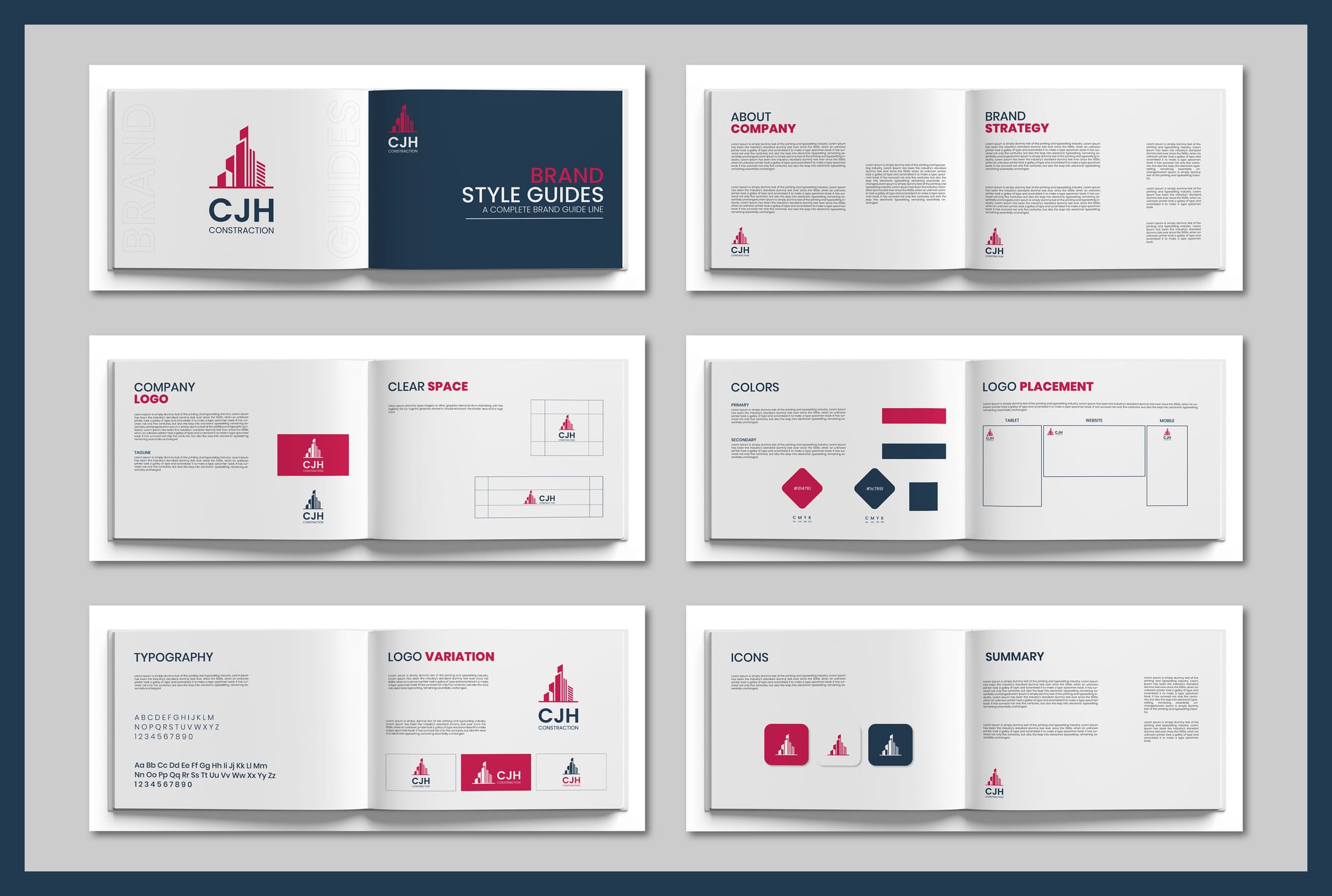
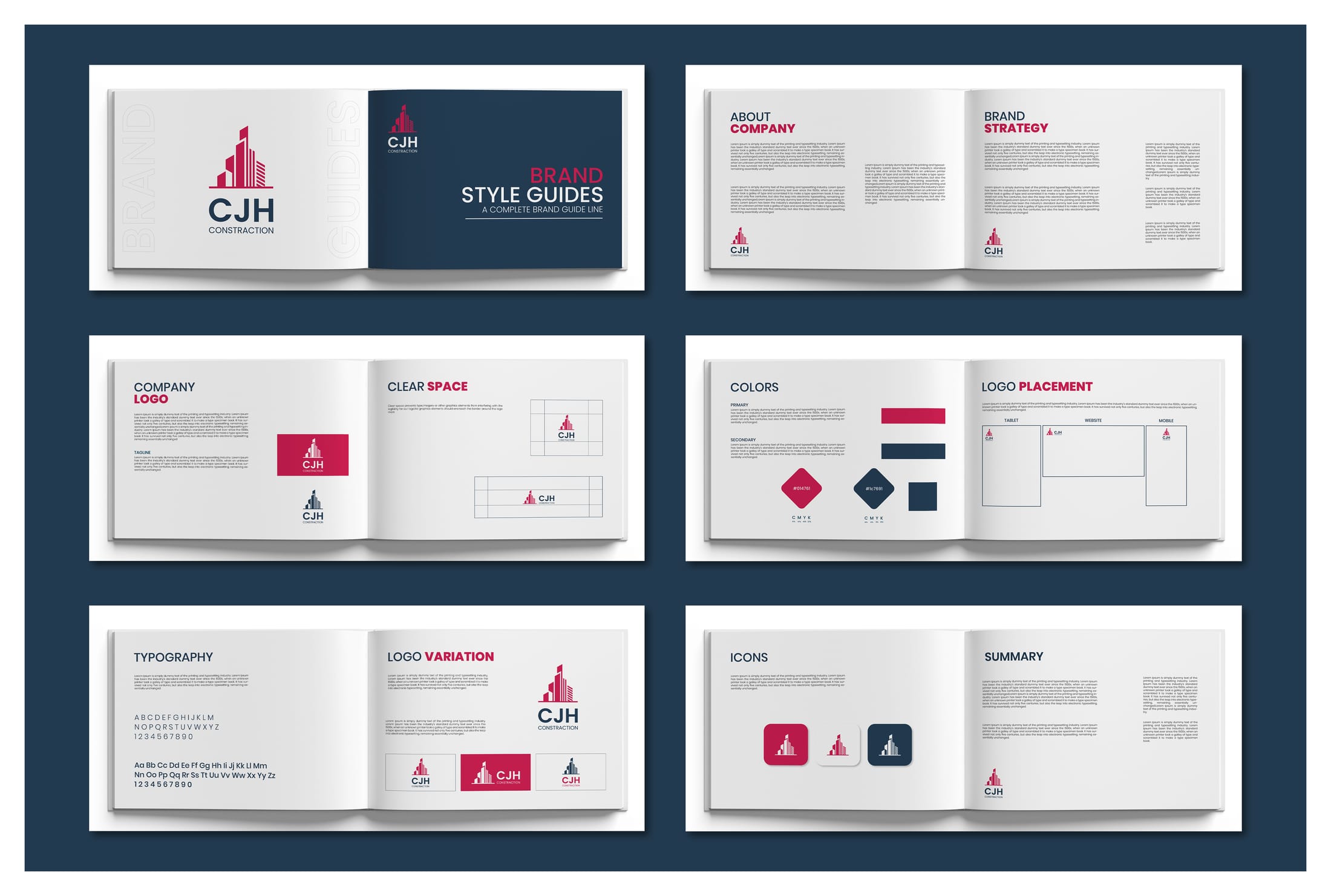
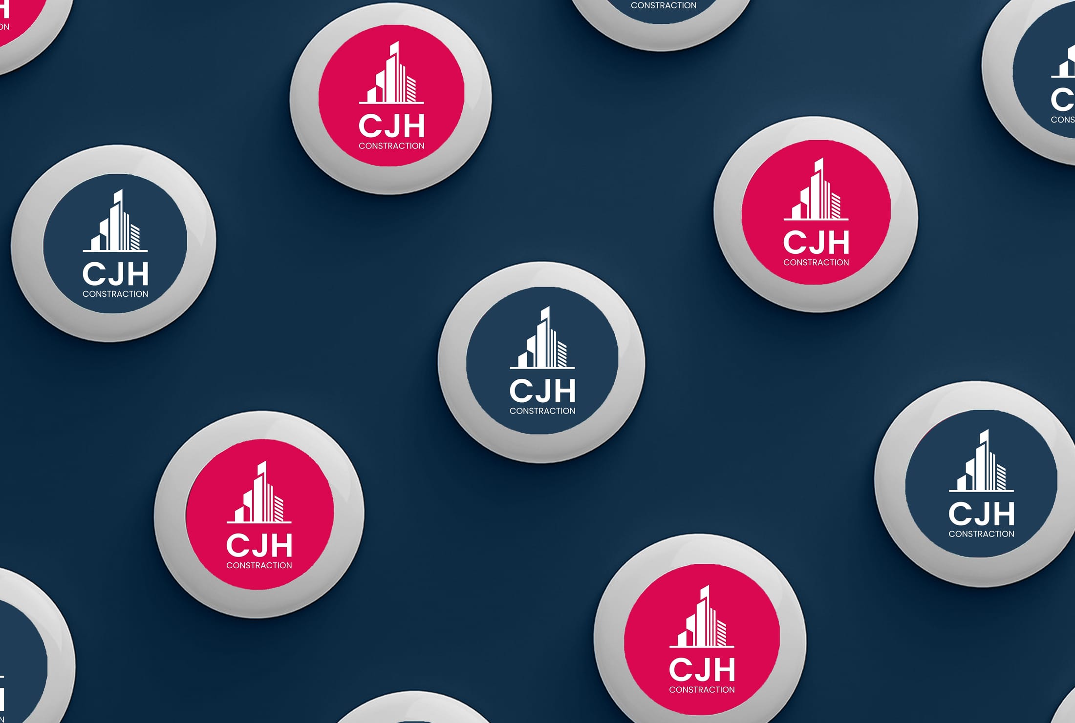
The result is a skyline-inspired mark supported by a disciplined white, navy, and magenta palette. The symbol turns construction ambition into a clean corporate silhouette — upward-moving and industry-relevant without leaning on clichés. Clean geometry and controlled whitespace communicate structure, credibility, and growth.
The brand guidelines lock the system in place across logo architecture, colour discipline, spacing rules, and asset hierarchy — giving CJH a repeatable identity that can expand with the business and stay consistent without constant design support.


Start your project
Need a brand that holds up on site and wins in proposals?
We build logo and identity systems for businesses that need branding to work in the real world — not just on a screen. If you want that same clarity for your company, let's build it together.