[ SCHEMATIC 01 ]
Spatial Packaging System
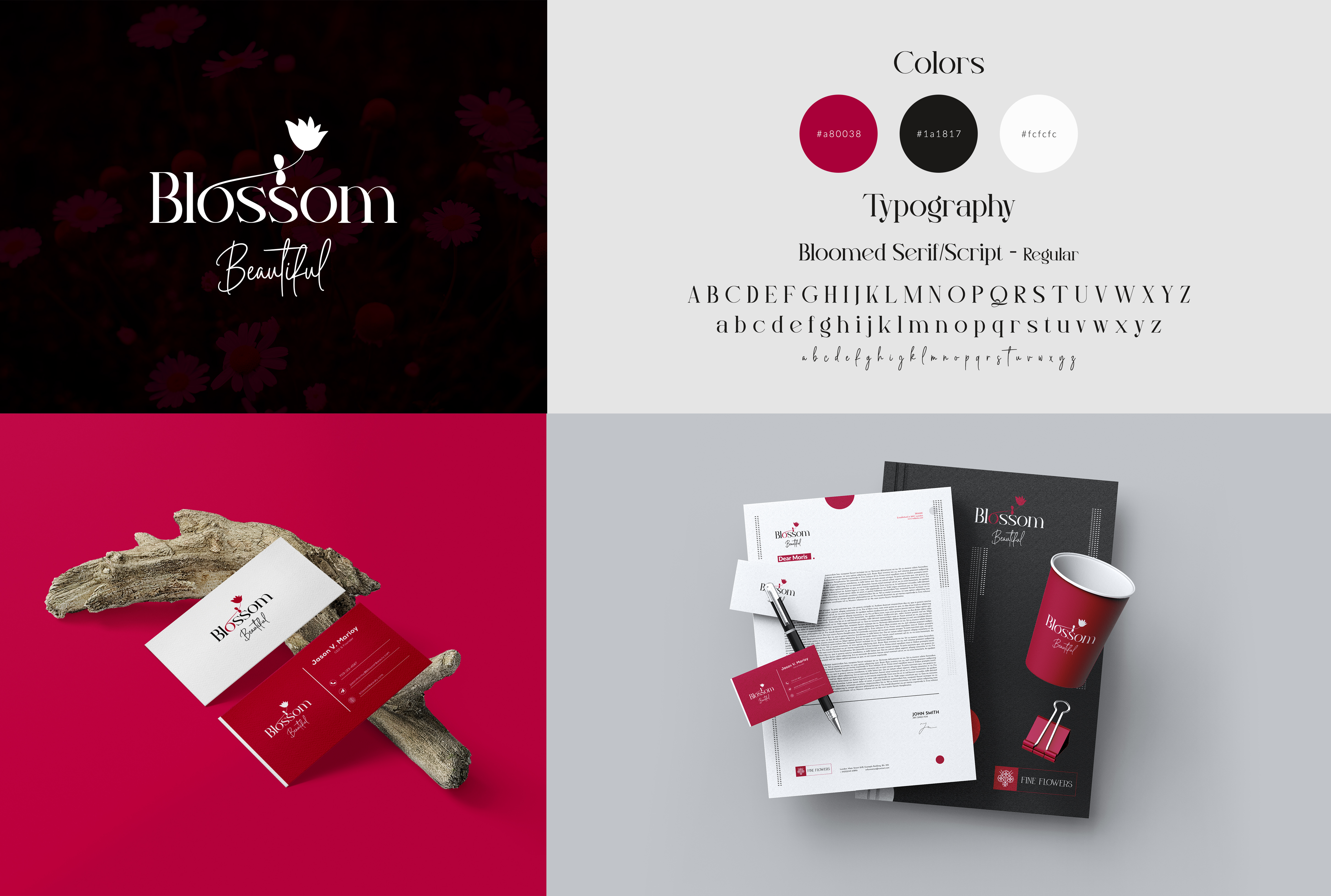
The premium shopping bag identity features textured matte-kraft surfaces, debossed borders, and structural custom cord handles.
[ FILE REFERENCED: so-squared-bag-design.jpg ]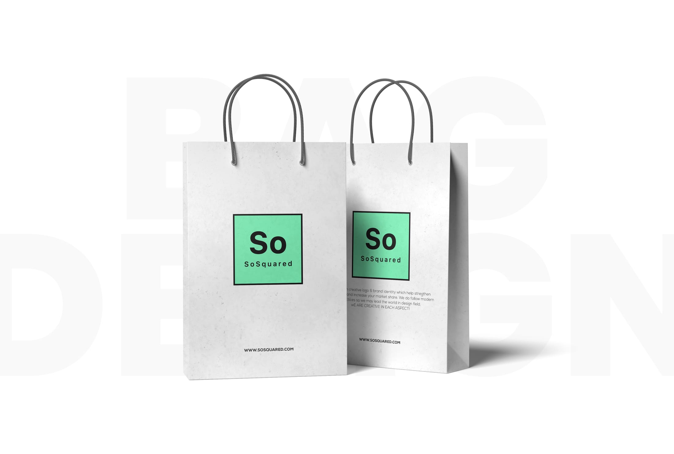
We create logo and brand identity systems that feel distinctive, professional, and easy to apply across packaging, stationery, digital touchpoints, and future rollout.
Responsive logomarks engineered for all scales, from favicon to billboard.
A cohesive aesthetic framework with exact colour and type scale logic.
A digital manual defining the structural rules of the identity.
Real-world visualisations across stationery, bags, and physical products.
A complete identity service with concept development, refined assets, and the rules needed to keep the brand consistent in day-to-day use.
Several distinct directions to react to — not a single take-it-or-leave-it idea.
We refine the chosen route until the proportions, weight, and spacing feel resolved.
Fully editable AI, EPS, SVG and PDF masters that scale from favicon to billboard.
A defined palette and typographic scale so the identity stays consistent everywhere.
Avatars, banners and favicon exports sized for every major platform.
A usage manual covering clear space, do's and don'ts, and the structural rules.
100% copyright and trademark rights transfer to you on final delivery.
Business cards, letterheads and packaging mockups built on the same grid.
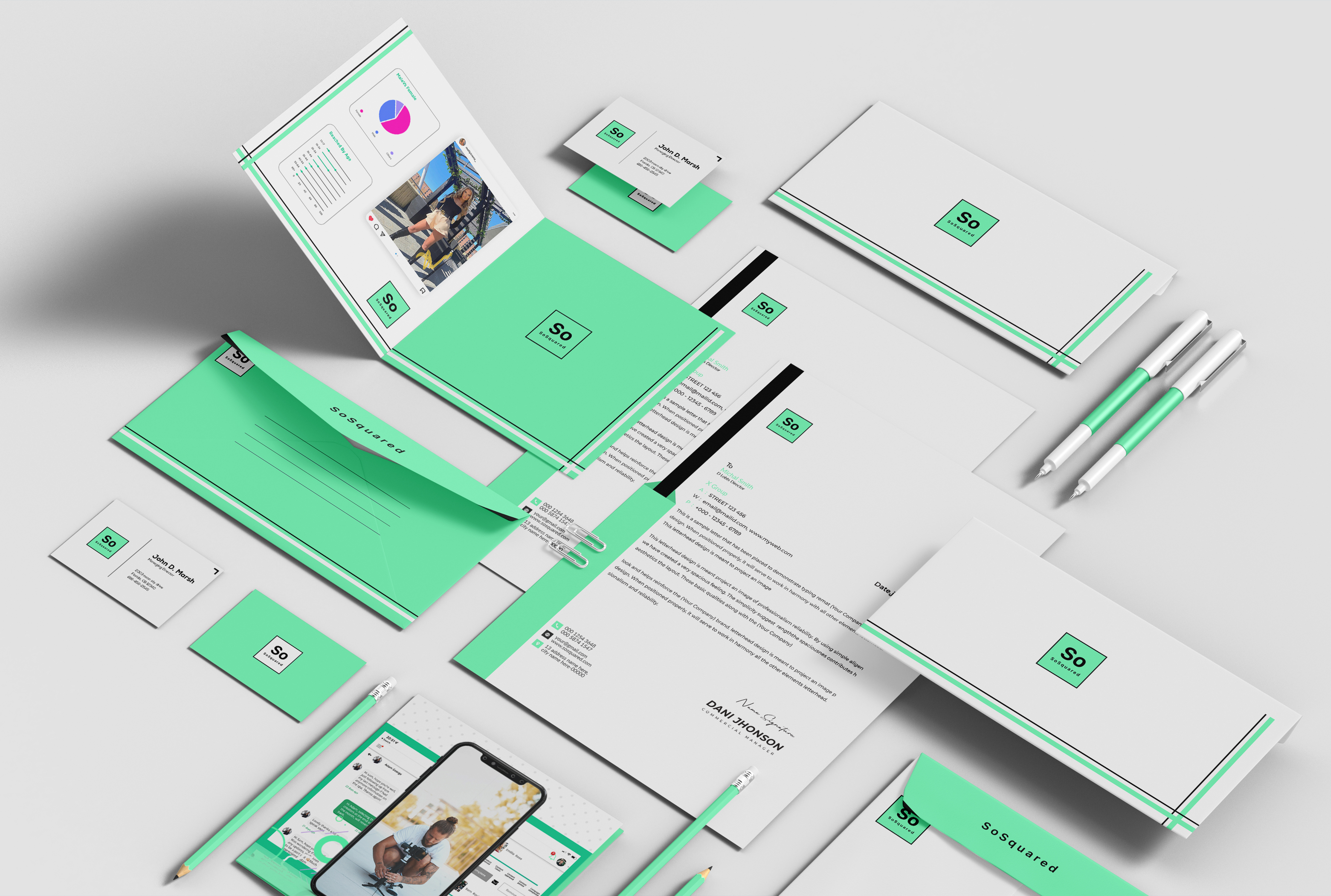
So Squared needed an identity that could work across retail packaging, printed collateral, and digital use without feeling fragmented. The brand had to look polished at launch and remain easy to extend as new applications were added.
We built the system around a simple square-led structure. That rule helped shape spacing, placement, proportions, and layout decisions across the entire identity, making the brand feel deliberate, cohesive, and easy to reproduce accurately.
“Good branding feels consistent because the rules behind it are clear.”— So Squared brand system
The So Squared mark is constructed on a 1:1 aspect ratio. Scrolling rotates the visual system from a Cartesian square into a dynamic diamond coordinate plane.
Every design decision originates from a perfect 1:1 aspect ratio. The solid mint-green foundation sets the parameters for scale, typography, and layout boundaries.
The primary base subdivides into secondary 2x2 matrices. Modular sections can transform independently while preserving the core geometry.
Signage and user flows are mapped along diagonal coordinate paths, guiding attention smoothly across the interface.
Responsive coordinate matrices and structural tokens keep typography and layouts anchored to the resolved grid.
The premium shopping bag identity features textured matte-kraft surfaces, debossed borders, and structural custom cord handles.
[ FILE REFERENCED: so-squared-bag-design.jpg ]Business cards, envelopes, presentation folders, letterheads, paperclips, and writing assets are mathematically aligned to the brand grid.
[ FILE REFERENCED: so-squared.jpg ]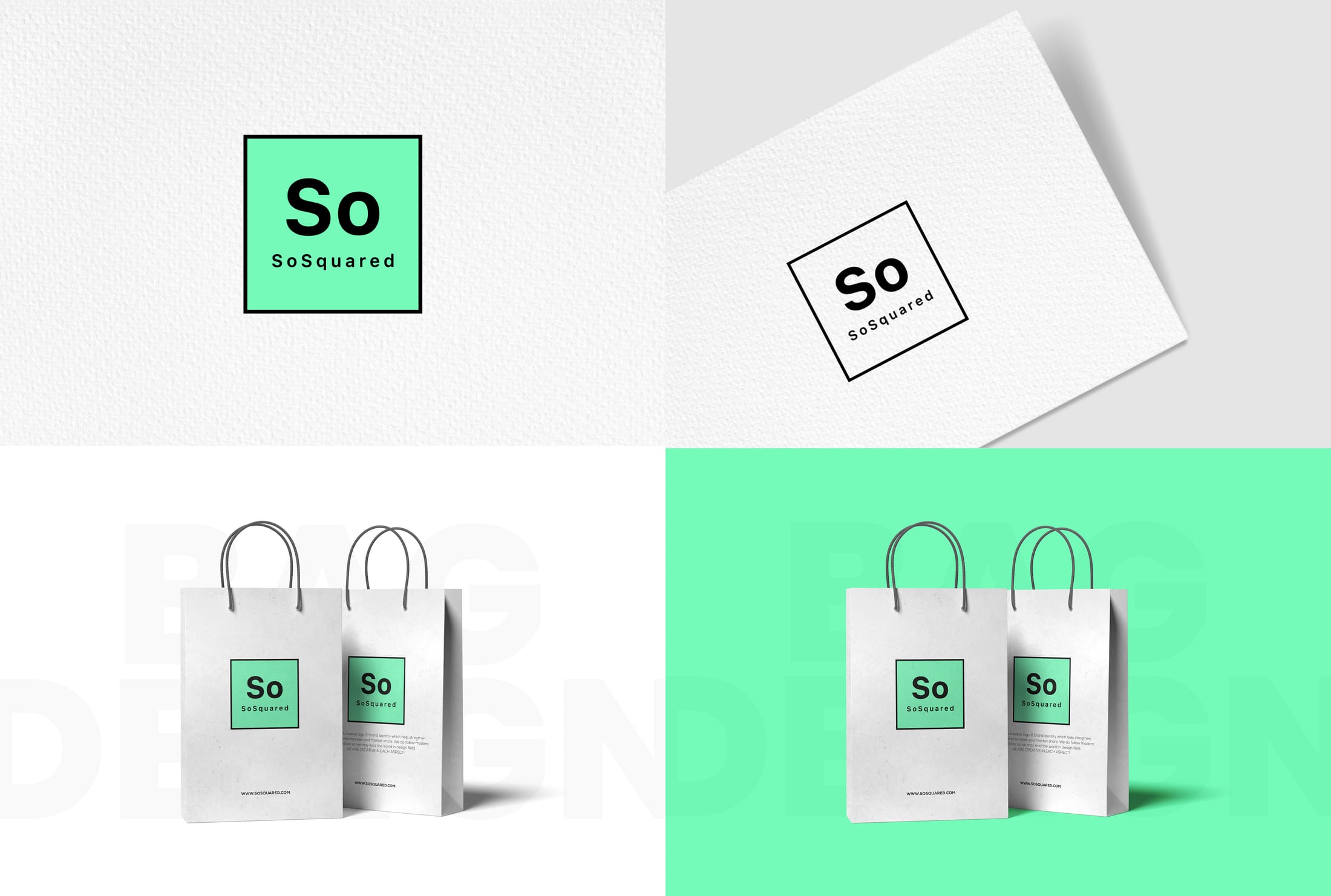
An alternate perspective of the corporate collateral system, showing notebooks, clipboards, and layered letterheads inside the same grid logic.
[ FILE REFERENCED: so-squared.jpg2.jpg ]
A closer look at how the brand system carries through packaging, print, and physical applications.
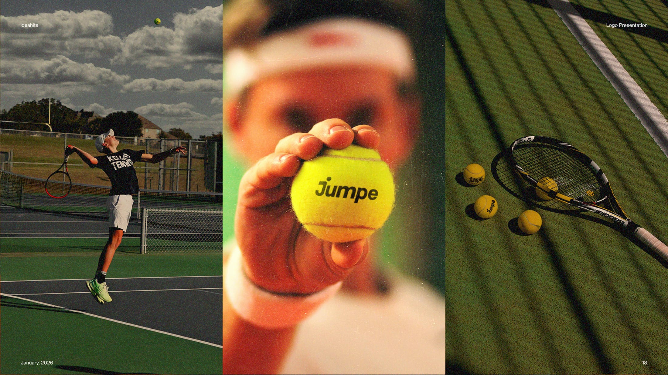
Jumpe needed a sportswear identity that felt energetic and premium at the same time, with enough structure to work across apparel, accessories, and digital launch assets.
We built the system around a motion-led mark, strong italic typography, and a tightly controlled black, white, and energy-orange palette that keeps every application fast, clear, and recognisable.
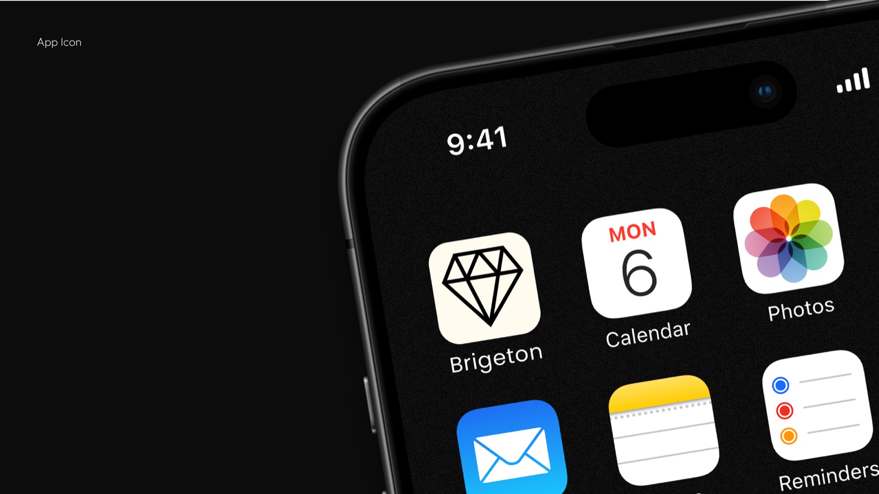
Brigeton Diamonds required a brand presence that felt refined, ceremonial, and luxurious without becoming overly ornate or difficult to apply across packaging and digital touchpoints.
The identity combines a restrained wordmark, elegant supporting symbols, and a black-and-ivory presentation system that gives the brand a polished luxury tone across print, packaging, and mobile surfaces.
The palette is built to create contrast, clarity, and recognition. Mint, coral, and deep blue each play a defined role, helping the brand feel consistent across screens, print, and physical materials.
*Scroll to see the colour split animate through the system.