Logo & brand starter
Start with one mark that already feels publishable.
This route is about solving the core logo cleanly so a founder can stop guessing and start using the brand with confidence across launch materials.
Core markFirst impression solved
AppliedLooks usable immediately
ToneA clean visual voice
Why this page exists
The first version of a logo should already feel clear enough to trust.
For early-stage brands, the goal is not complexity. It is clarity, recognition, and a mark that can start carrying the business without apology.
01
Clarity
The mark has to read quickly before it can become memorable.
We prioritise silhouette, spacing, and visual confidence so the identity feels deliberate even in its simplest form.
02
Usefulness
A starter logo is only strong if it already works on real things.
We pressure-test the mark in practical contexts so the brand does not collapse the moment it leaves the artboard.
03
Confidence
Founders move faster when the identity already feels finished enough to ship.
A good starter route gives you enough consistency to launch, pitch, post, and present without waiting for a full brand book.
How the route is built
We keep the process tight so the logo gets solved before momentum disappears.
This page is shaped around one clear mark, one clean direction, and enough supporting logic to make it usable from day one.
We pull out the most useful visual idea from the brief and shape it into a recognisable mark.
Type, spacing, and proportion are adjusted until the logo feels stable and easy to place.
The mark is previewed in a few essential settings so you can judge it in context.
You receive the core files needed to publish and move forward confidently.
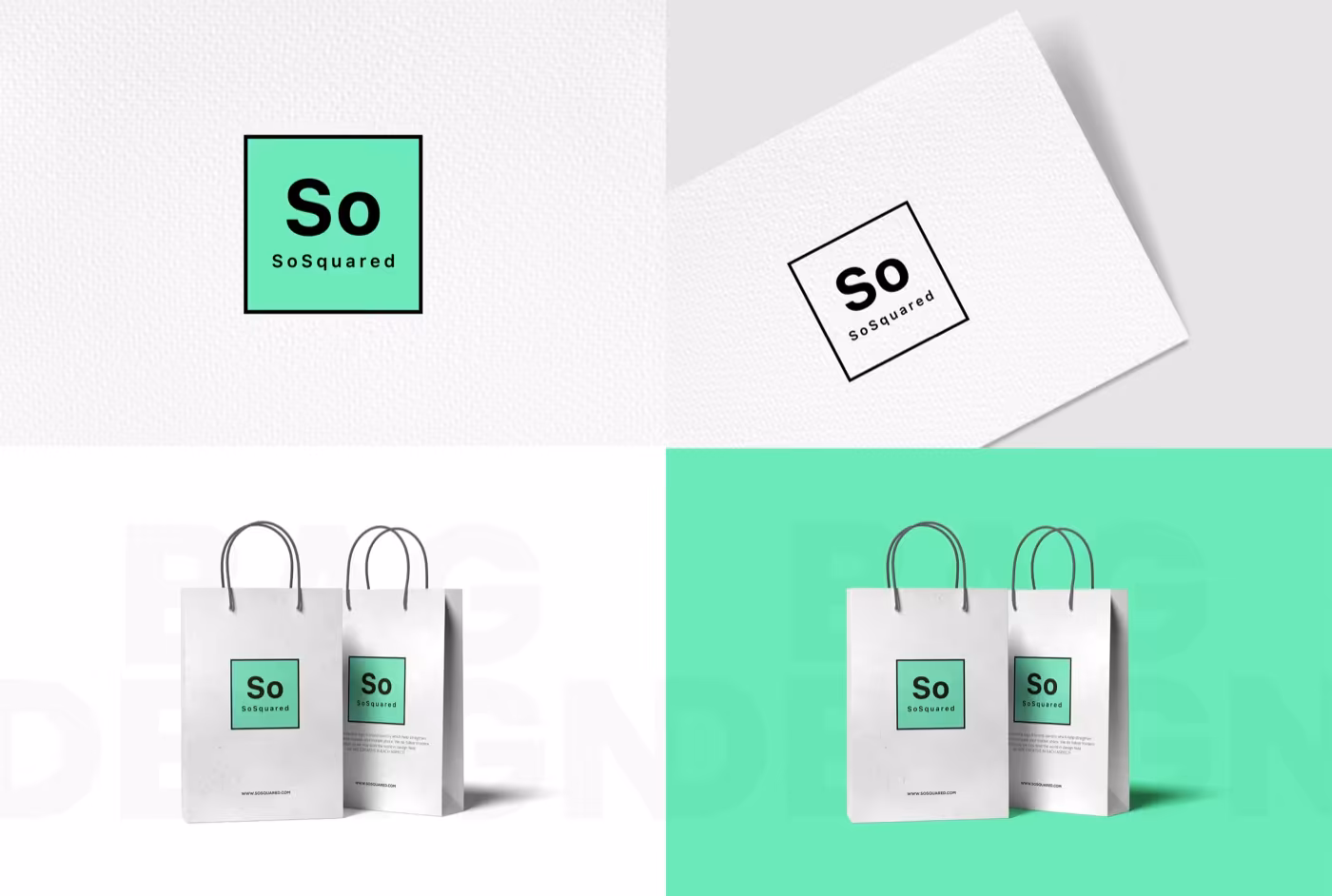
What this starter route proves
A focused logo page should still show enough range to feel real.
The examples below show how a starter mark behaves across simple applications without pretending to be a full brand system.
Icon-led conceptStrong enough to hold attention in small spaces.
Packaging checkAlready usable on a practical product surface.
Minimal rolloutClean enough to feel mature without heavy styling.
What comes with it
Everything needed to get the logo into use quickly.
This route is intentionally lean. It is made to remove hesitation, not bury the project in extras.
- Primary logo concept
- Secondary lockup or simplified variation
- Core colour and type direction
- PNG, SVG, and print-ready exports
- A few basic application previews
Why this feels safer
It gives the brand a usable first identity instead of another vague draft.
Clearer first impression for launchA logo tested in simple real contextsFiles you can actually hand to partnersA route that still leaves room to grow later
Best for
Founders who need the logo solved before anything else can move.
If the business needs one clear mark first, this page is the fastest route to a sharper visual starting point.
This route keeps the decision focused so the mark lands faster.
The file set is built for immediate use across the basics.
It solves the logo before expanding into a bigger brand system.