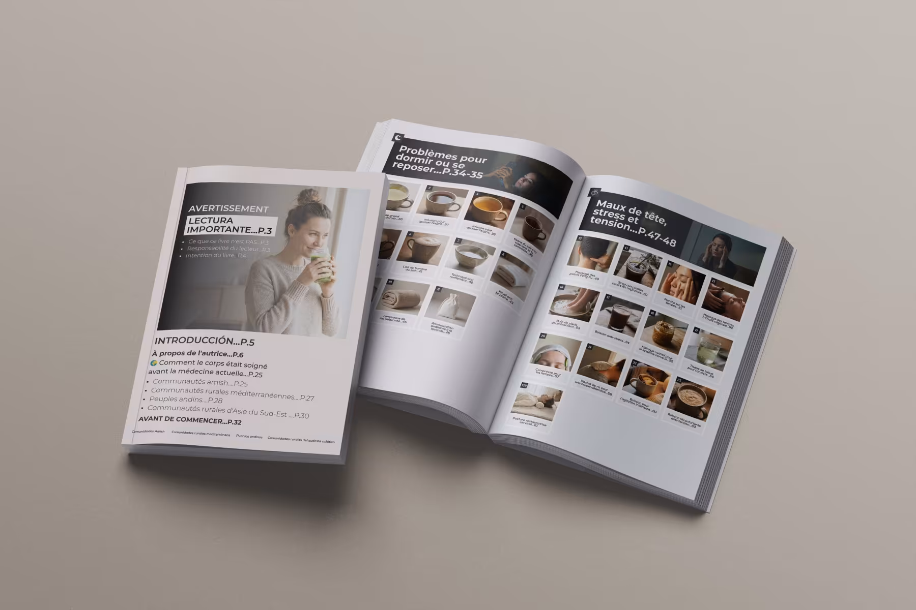
Magazine feature spread
Design a spread that feels like a feature, not just another pair of pages.
This route is for editorial work that starts with a hero spread and needs stronger visual pace across headline, image, and text blocks.
FeatureHero editorial moment
SupportCan extend into a wider system
ContextFits a broader issue
Why this route is specific
Feature spreads need more visual drama and pacing than a basic publication template.
This page is about the kind of spread that sets the tone of an article, section, or magazine issue.
01
Hero moment
The spread has to feel like the editorial high point, not just a placeholder for copy.
We shape the main spread around visual pacing, image scale, and enough contrast to feel special.
02
Support
A feature spread works best when the supporting page logic can keep up with it.
The strongest editorial pieces connect the standout spread to a broader internal rhythm rather than leaving it isolated.
03
Context
The feature should still feel like it belongs inside the wider publication.
The route balances standout design with enough continuity to fit the issue or publication around it.
How we build it
We start with the hero spread and then support the rhythm around it.
That keeps the editorial work visually strong where it matters most first.
We decide how dramatic, minimal, or image-led the spread should feel.
Headline, imagery, and body layout are shaped into the main editorial moment.
Surrounding page logic is designed to help the feature feel coherent.
Final layouts are organised for print or editorial handoff.
Where it proves itself
This page is about standout spreads and the editorial rhythm that supports them.
The references stay close to hero-spread performance rather than cover-only work.
Hero spreadThe main editorial moment that anchors the feature.
Supporting pagesA spread works better when the pages around it still feel connected.
Issue contextThe feature still belongs inside a broader publication rhythm.
Included here
A feature-led editorial package with stronger visual pacing.
This route starts with the hero spread and builds enough support around it to feel intentional.
- Hero spread concept
- Supporting editorial layout logic
- Headline and image pacing
- Print-ready spread exports
- Presentation mockups or boards
Why it helps
It gives the editorial piece a memorable visual centre instead of a generic layout.
Stronger feature presenceMore polished editorial pacingBetter connection between hero spread and supporting pagesCleaner review and handoff visuals
Best for
Editorial pieces that need a standout spread before the rest of the issue can feel right.
If the feature spread is the moment that has to carry the publication visually, this route keeps the work centred there.
This page is built around the spread that sets the tone.
The route balances standout design with readable structure.
The spread still connects back to the larger publication.