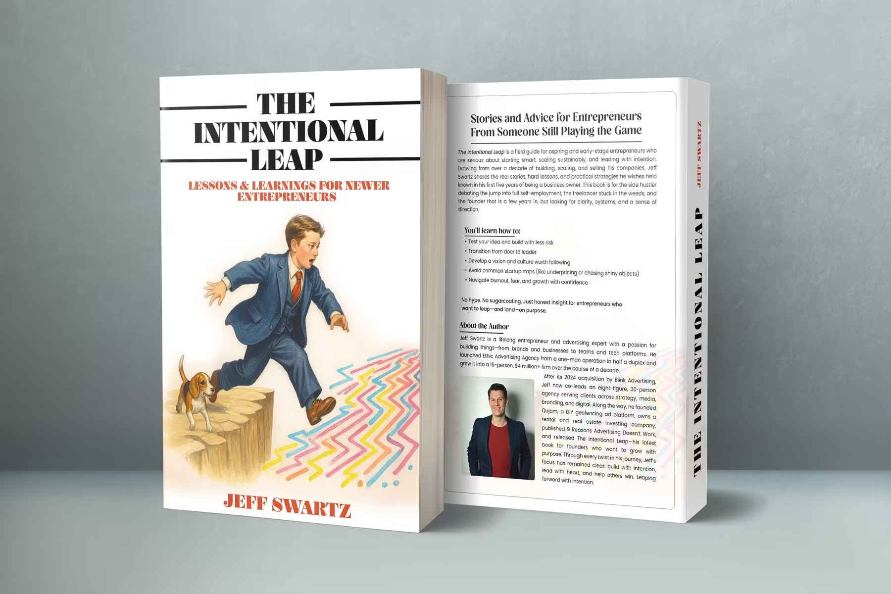
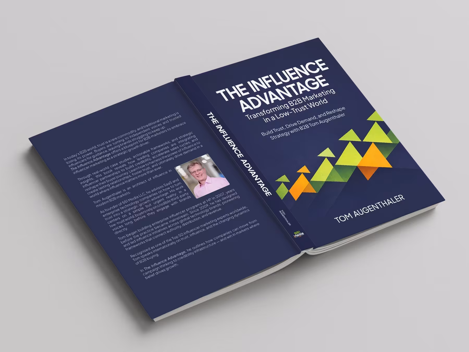
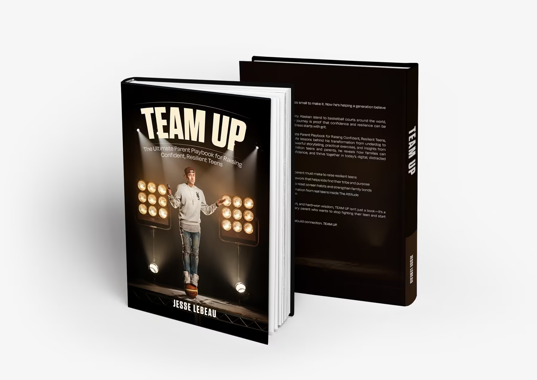
Book cover direction
Give the publication a cover that already feels like it belongs on a shelf.
This route focuses on the front cover first: title hierarchy, subject tone, and that critical first impression before anyone turns a page.
CoverMain front-face route
FlatDesign at true proportion
ReferenceCan extend later
Why this route matters
The cover has one job first: make the book feel intentional enough to pick up.
A stronger cover gives the publication a clearer market position and a better first emotional read.
01
First impression
The cover should communicate tone before the reader knows the full content.
Typography, image balance, and title treatment do most of the work in those first few seconds.
02
Hierarchy
A cover works better when title, subtitle, and author all know their place.
We refine the pacing so the publication feels more polished and less visually confused.
03
Potential
A good cover direction can still become a wider jacket or publication system later.
Even if the route starts with the front face, the design should still leave room to expand.
How we build it
We tune the cover around tone, hierarchy, and market feel.
That keeps the route focused on the part of the publication that gets judged first.
We define the emotional and market direction the cover should communicate.
Title, subtitle, and supporting visual elements are organised into a cleaner face.
Mockups show the design at realistic proportions and on-object context.
Final files are organised for print or publishing handoff.
Where it proves itself
This page is about the front cover first, not the whole publication system.
The examples stay close to title hierarchy, market tone, and shelf impression.
Primary coverA cover route designed to feel intentional and market-aware.
Flat artworkThe design still needs to hold on the page, not only in mockup form.
Expansion referenceThe cover can later grow into a broader jacket treatment if needed.
Included here
A focused book-cover package built around first impression.
This route stays narrow so the front cover gets solved properly before anything broader.
- Front cover concept
- Title hierarchy refinement
- Mockup presentation
- Print-ready artwork exports
- Light supporting versioning if needed
Why it helps
It gives the publication a stronger visual first encounter.
Clearer market positioningBetter title hierarchyStronger object-level presentationA cleaner route into publishing handoff
Best for
Books that need the cover solved before anything else expands.
If the first job is to make the publication look sharper on first contact, this route is the right fit.
This page is built around the cover face itself.
The route prioritises readable editorial pacing.
The artwork is delivered for practical publishing use.