Retail branding case study
A precise identitysystem that turnsorder intopremium presence.
So Squared was shaped around a simple but powerful idea: if the geometry is disciplined enough, the brand never has to shout. A square frame, a confident wordmark, and a restrained mint-black palette create an identity that feels modern, crisp, and highly repeatable.
What makes this case study work is the way it tells the whole story. The guidelines justify the system, the mockups prove its range, and the final applications show how the brand can stay calm and memorable across packaging, stationery, and everyday business touchpoints.
The brand story
So Squared begins with a disciplined shape and turns it into a complete brand language.
The square is doing more than framing a logo. It gives the brand its posture. It suggests structure, confidence, and clarity, which makes the identity feel reliable from the first glance. That sense of order is what helps even the simplest composition look premium.
The mint accent stops the system from feeling sterile. It adds freshness and lift, while black and white keep the communication grounded. Together they create a brand world that feels contemporary, clean, and practical for real business use.
Strategic framing
The presentation earns trust by showing the rules behind the beauty.
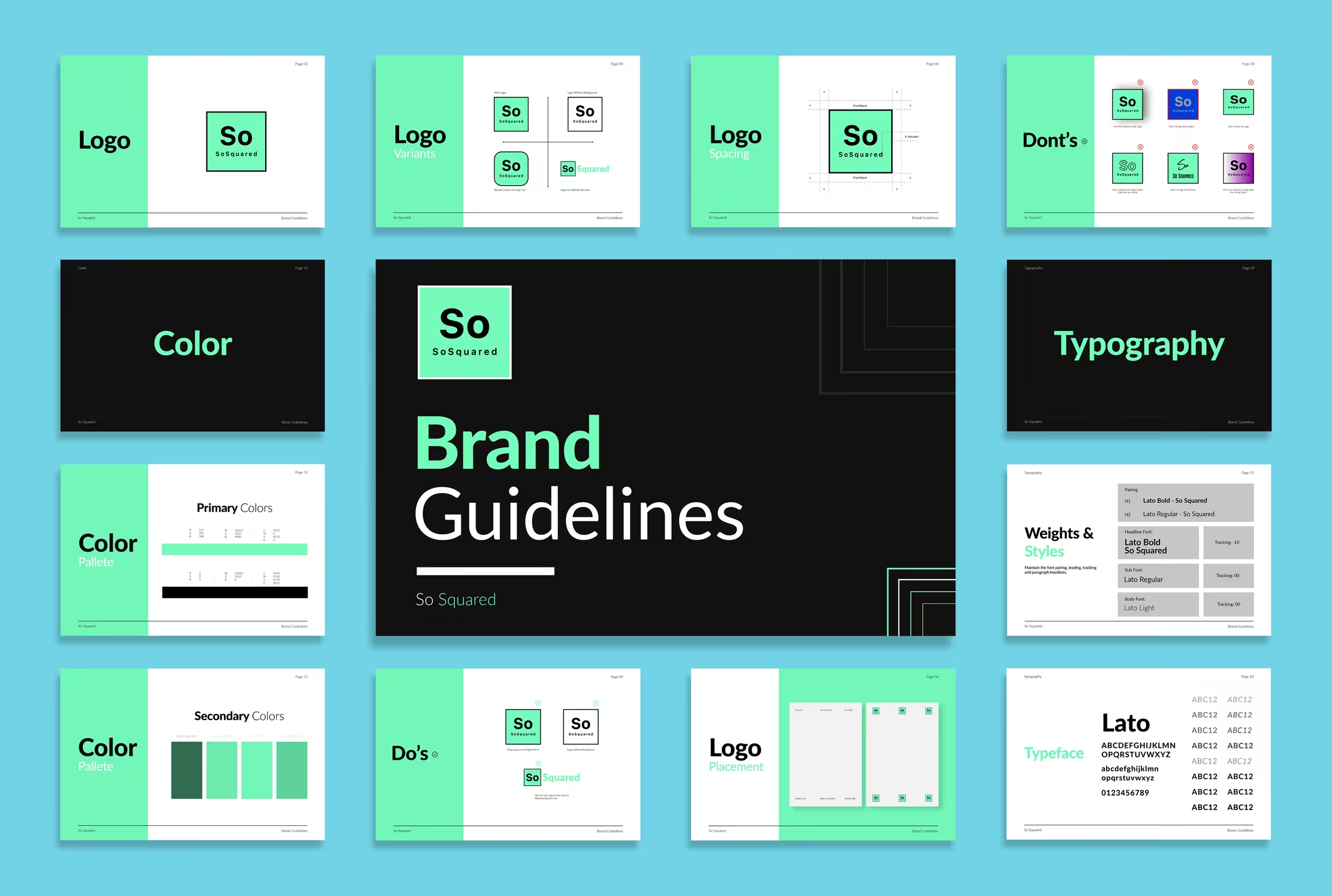
So Squared works because the identity is never left to instinct alone. The brand guidelines explain the logic, the spacing, the palette, and the acceptable variations, so every later application feels controlled and repeatable rather than improvised.
Brand architecture
The identity is presented like a system first, and that makes the visuals feel more believable.
So Squared is not introduced as a loose moodboard. The guideline spreads immediately establish structure through logo rules, spacing logic, color discipline, and type hierarchy. That foundation is what gives the later mockups their authority.
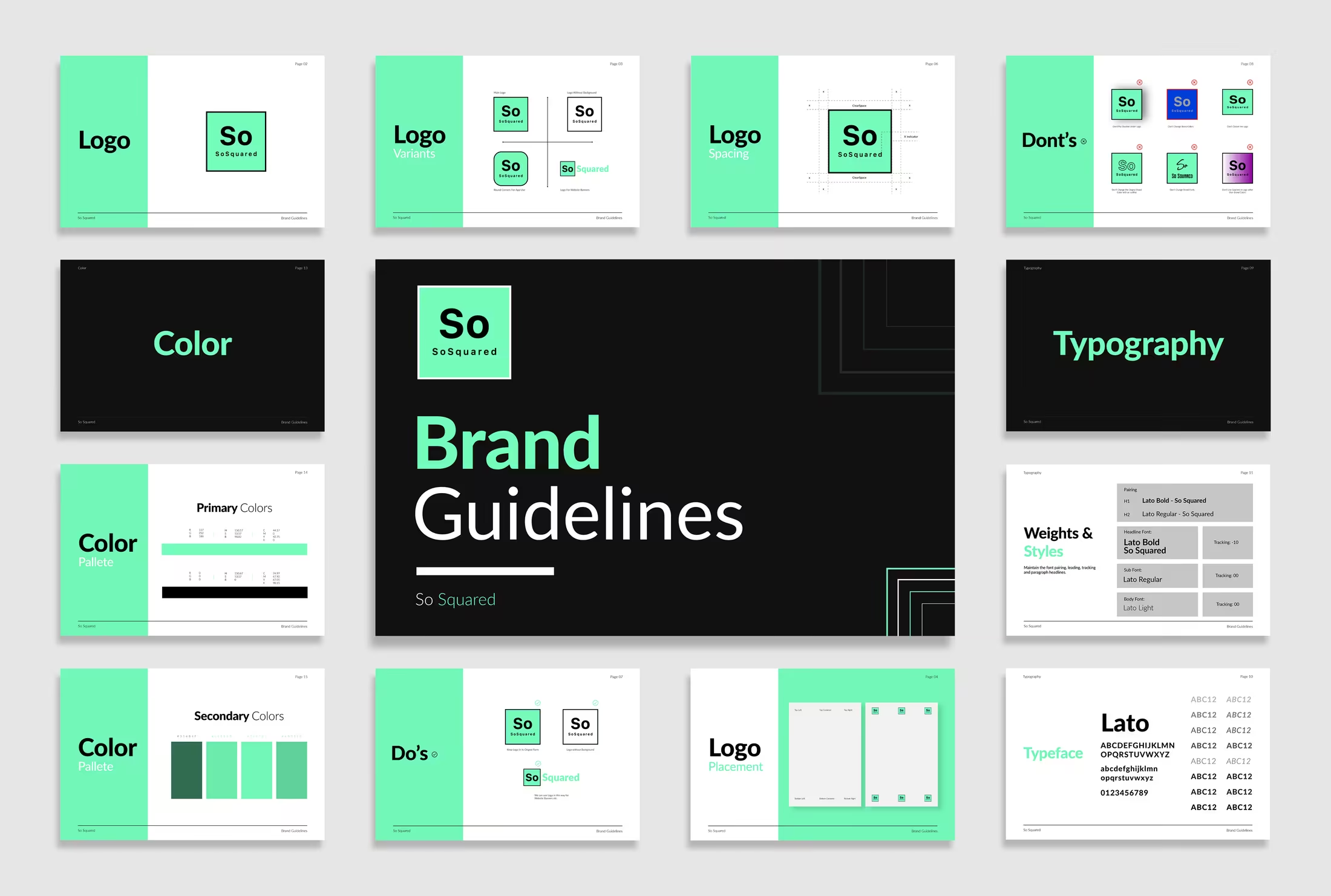
Consistency rules
A minimal mark only stays memorable when the rules around it are equally clear.
The second guideline board shows how the square container, the So wordmark, and the surrounding whitespace are meant to behave. Variants, do's and don'ts, and construction references stop the brand from drifting into inconsistent execution.
Retail signal
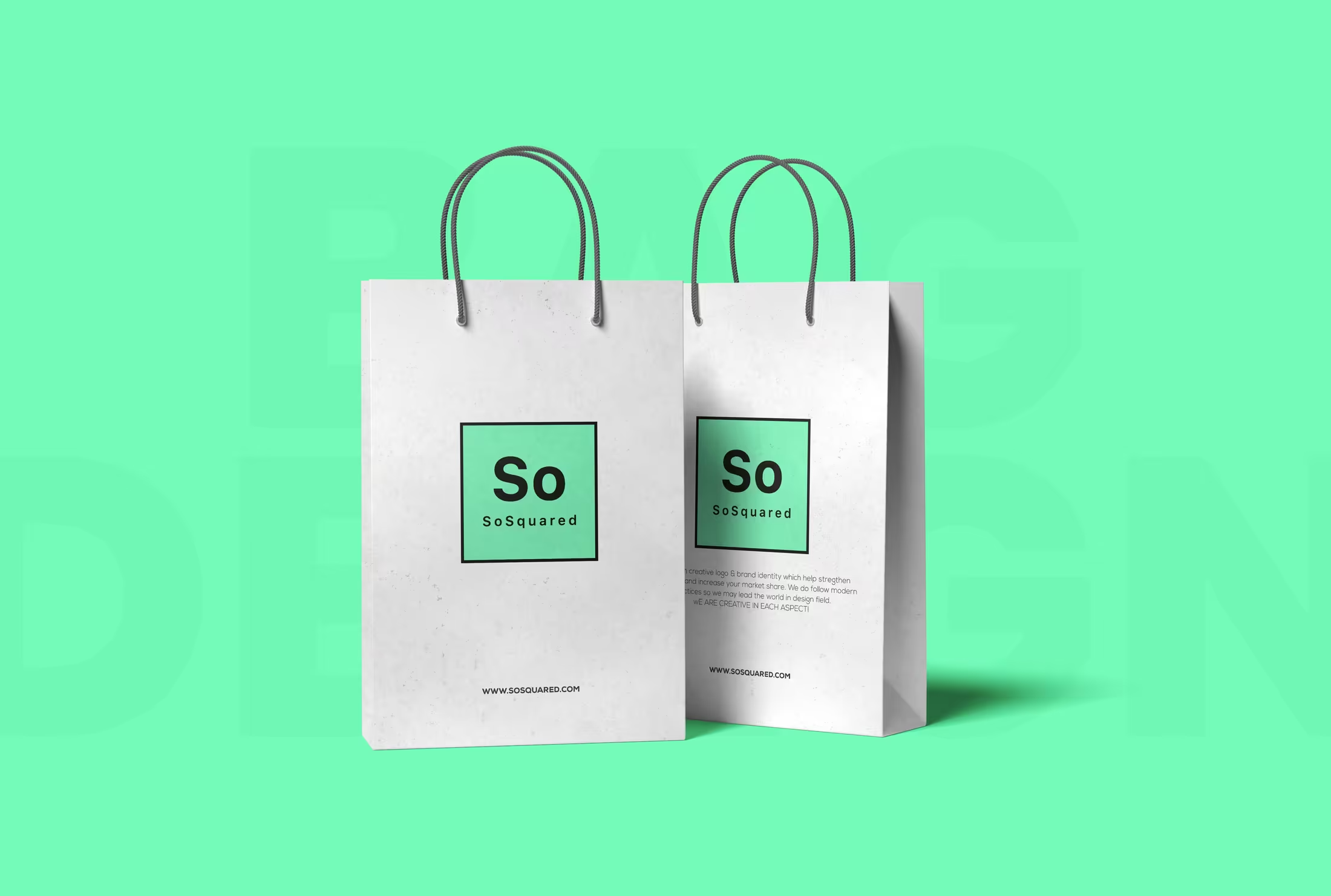
The mint square gives the brand a shelf presence that feels fresh without trying too hard.
Packaging is where the idea starts to prove itself. The mark is simple, but the contrast between mint, black, and white makes it read quickly, which is exactly what a retail-facing identity needs when it sits among competing products and packaging.
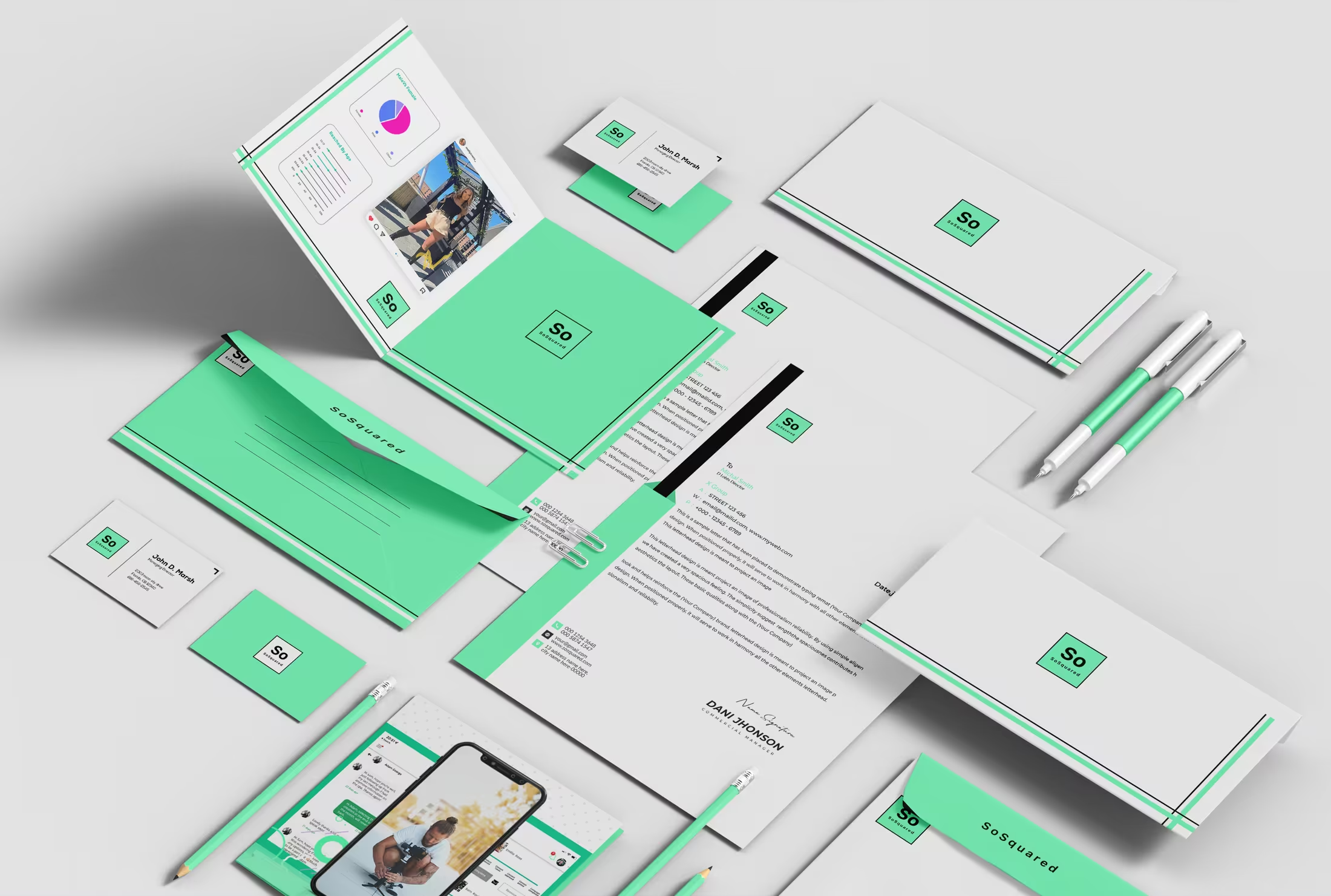
Operational rollout
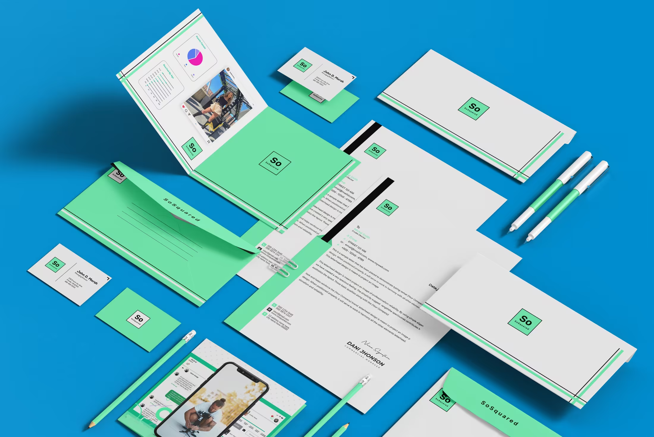
The same discipline carries through stationery, digital, and day-to-day business touchpoints.
The stationery compositions matter because they show the brand under repetition. Letterheads, folders, pens, and business cards all keep the same proportions and graphic rhythm, which is what turns a neat logo into a usable business identity.
Identity system
The logo is restrained on purpose, so every decision around it has to be exact.
Minimal branding only feels premium when proportion, spacing, and placement are handled with intent. The So Squared system shows how a quiet mark can still build strong recall when the supporting rules are clear and the visual language stays disciplined.

Core mark
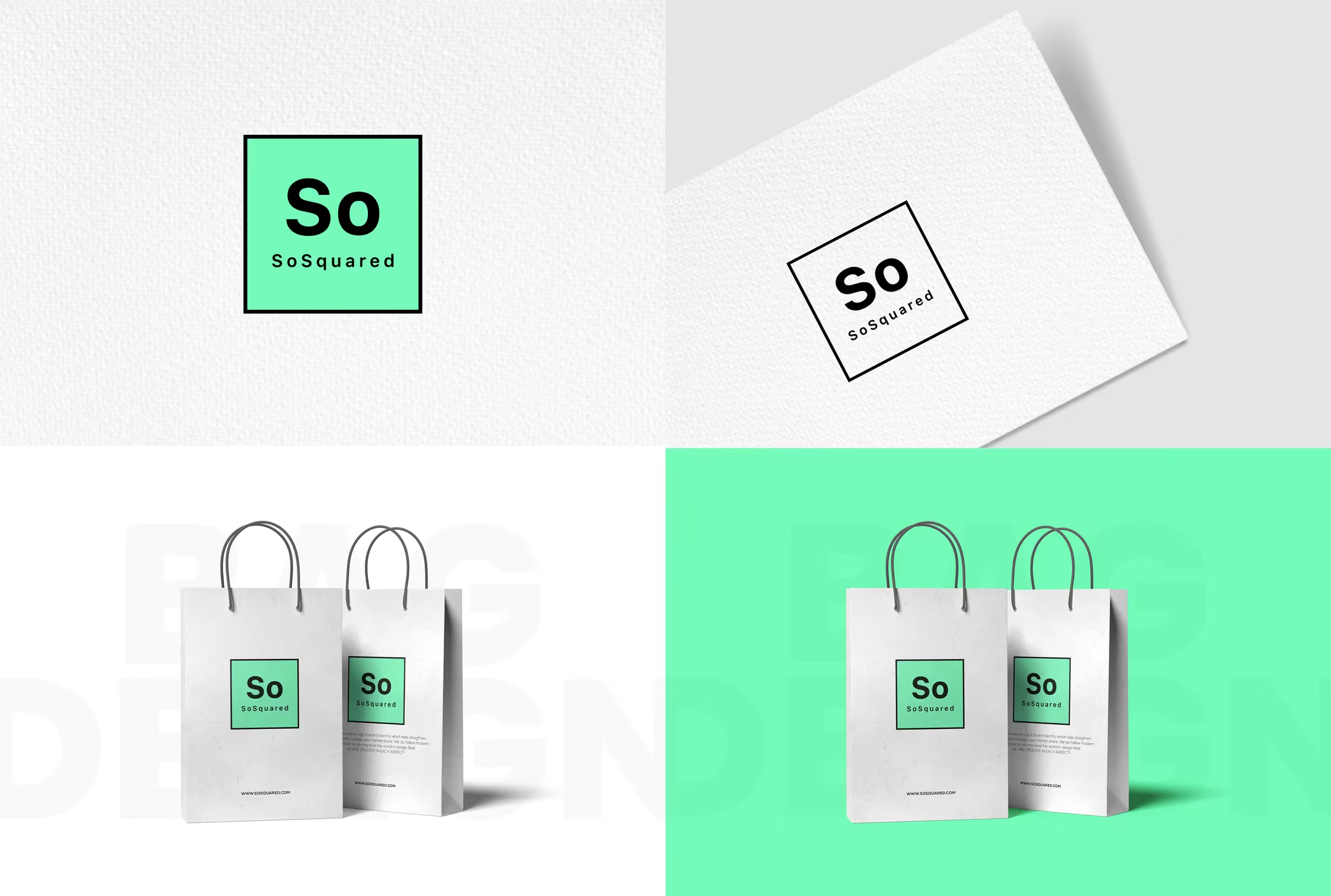
A square frame turns the name into a contained, instantly ownable signature.
The frame does more than decorate the logo. It creates a repeatable unit that feels organised, modern, and easy to place. That containment gives the identity a premium calmness while still making it highly visible.
Controlled contrast
Mint brings freshness; black provides confidence; white gives the brand its breathing room.
The palette is intentionally restrained. Instead of leaning on a large color library, So Squared uses one memorable brand color and surrounds it with neutral space. That keeps the system clean and helps every application feel considered.
Flexible expression
The identity survives inversion, layering, and scale changes without losing its character.
From paper compositions to packaging mockups, the mark stays recognisable because the geometry is stable. That flexibility is what makes the brand practical for both polished presentations and real everyday use.
Rollout thinking
Once the rules are stable, the brand can scale across touchpoints without losing its calm.
So Squared is strongest when it moves beyond the logo and into repetition. Shopping bags, business stationery, printed collateral, and digital surfaces all show the same square logic, the same color restraint, and the same controlled use of space.
That repeatability is the real success of the identity. It lets the brand appear modern and premium across very different formats while still feeling like one coherent business rather than a collection of separate design exercises.
- Square-based logo system with clear spacing and usage control
- Mint, black, and white palette designed for contrast and freshness
- Retail bag, stationery, presentation, and business collateral applications
- Guideline-led rollout that keeps the identity consistent under repetition
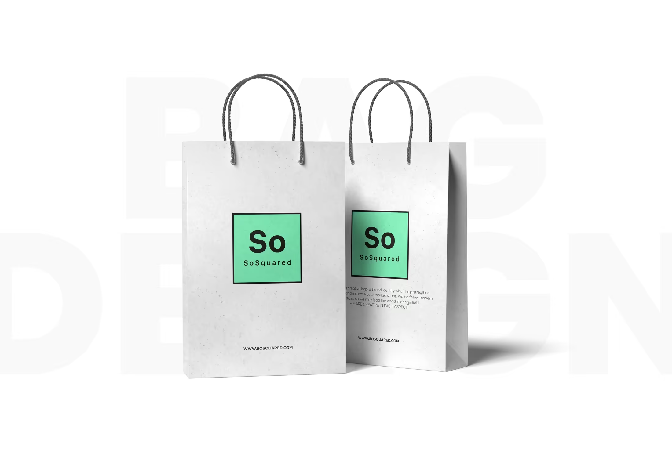
Packaging
The shopping bags translate the identity into something tactile, public, and retail-facing.
The bag mockups show the best version of the brand promise: simple, clean, and highly legible from a distance. The square mark becomes a badge, while the rest of the layout stays quiet enough to let the logo lead.
Expanded composition
The mint-field application makes the brand feel bolder without sacrificing its precision.
When the background flips to mint, the same logo becomes more assertive. That is useful because it gives the brand two different emotional settings: one softer and gallery-like, one brighter and more promotional.
Stationery system
The collateral suite proves the identity can support real communication, not just hero mockups.
Folders, business cards, digital screens, and letterheads all share the same line language and spacing logic. That consistency makes the brand feel operationally mature, which is essential for service businesses and product-led companies alike.
Brand world
The broader presentation ties the mark, packaging, and communication assets into one coherent story.
The final branded compositions show how the identity behaves as a world rather than a single asset. The same geometry, palette, and spacing rules keep everything aligned, whether the surface is a bag, a card, or a presentation board.
Complete presentation
The full So Squared brand story, from rules to rollout.
Every provided image is included below so the page reads like a complete case study: the guideline boards, the square-based identity logic, the packaging directions, the stationery applications, and the final collateral compositions that make the branding feel complete.
The case study opens by presenting the identity as a system with logic, not a loose style direction.
Variants, spacing, type, and usage examples give the mark enough governance to stay consistent.
A quiet white bag lets the mint square behave like a premium retail badge.
The same asset becomes more promotional and high-energy when placed against a full mint field.
Logo treatments and material mockups show how the square signature behaves in different contexts.
The brand stays coherent even as the compositions shift in scale, placement, and background tone.
Letterheads, cards, folders, and digital elements extend the same geometric calm into business communication.
The final spread gathers packaging, stationery, and brand presentation elements into one clear visual language.
Ready when you are
Need a brand system that feels this clear, calm, and usable in the real world?
We can build the same kind of disciplined brand story for your business, from the core mark and rule-set through to packaging, print, digital collateral, and the touchpoints people actually remember.