source visuals turned into one complete construction case study
Construction branding case study
A construction identitybuilt for trust,clarity, andsite-ready presence.
CJH needed a brand that could do two jobs at once: look polished in proposals and feel dependable in the physical world of construction. That meant building a system that could live on paperwork, signage, tools, and safety gear without losing authority.
The result is a skyline-inspired mark supported by a disciplined white, navy, and magenta palette. It feels ambitious, organized, and practical, giving CJH a brand presence that matches the scale of the work it wants to win.
branding system designed to hold up on gear, print, and signage
guidelines that keep the mark clear, consistent, and professional
Brand direction
Designed to make construction feel credible, current, and easy to trust.
The core idea was simple: the brand should feel as solid as the work. Instead of leaning on generic industrial tropes, the identity uses clean geometry and disciplined layout to communicate structure, confidence, and growth.
A skyline mark with purpose
The symbol turns construction into a memorable silhouette. It feels structural, upward-moving, and immediately relevant to the industry without relying on cliches.
Confidence through restraint
CJH does not need a noisy system to feel strong. The balance of white space, navy, and a sharp magenta accent creates authority while still feeling modern.
Made for daily use
This is the kind of identity that has to survive real business conditions: proposals, hard hats, invoices, clipboards, badges, and site tools.
Guideline system
The identity is backed by rules, not guesswork.
A construction company grows through repetition: repeated trust, repeated delivery, repeated visibility. The brand guidelines make that repetition possible by documenting logo behavior, color usage, spacing, and asset hierarchy in a way the whole company can follow.
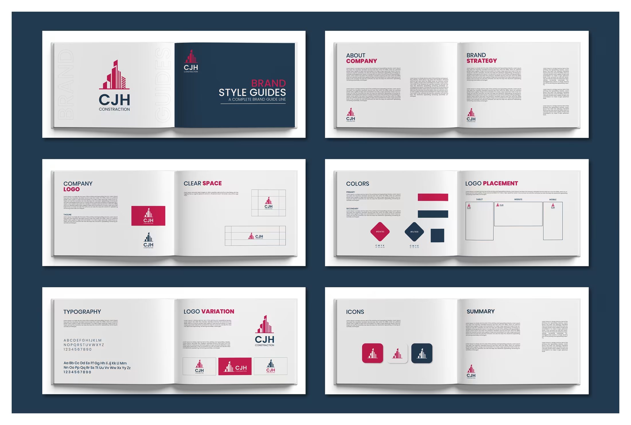
Logo architecture
The guide defines how the skyline icon, wordmark, and supporting variations work together without losing clarity.
Color discipline
A deep construction navy and vivid magenta create a palette that feels bold enough to stand out and controlled enough to stay credible.
System continuity
From icons to placement rules, the guidelines make sure every future asset still feels like CJH and not a one-off design.
Real-world rollout
The system proves itself where construction brands actually live.
Strong branding in this sector is not just about a logo on a website. It has to work on helmets, invoices, clipboards, handheld tools, and every printed touchpoint a client or team member sees on the way to a finished project.
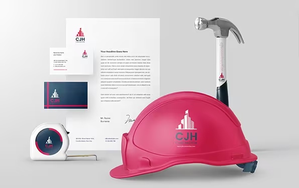
Site identity
On protective gear and tools, the logo stays readable and professional. It signals safety, trust, and ownership the moment it appears on site.
Stationery system
Letterheads, cards, and branded print collateral give the company a polished front-of-house presence to match the field operation.
Recognition assets
Badges and branded elements prove the mark can stay recognizable even in small-format applications where clarity matters most.
Full presentation
Every frame adds up to one dependable construction brand story.
Taken together, the logo, guidelines, stationery, and field mockups show how CJH can present itself with the same level of care on paper, on site, and in every client-facing moment.
Master mark
The logo introduces a clean skyline symbol that ties construction ambition to an unmistakable corporate silhouette.
Brand toolkit
The main identity mockup shows how the system moves across cards, letterheads, site gear, and small branded tools.
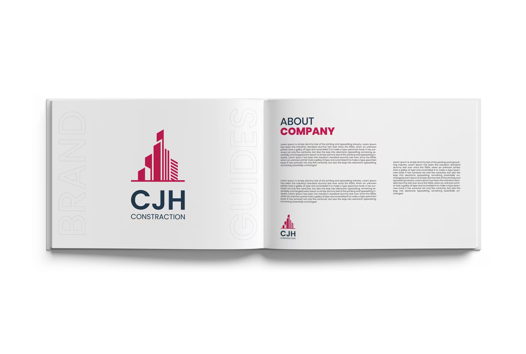
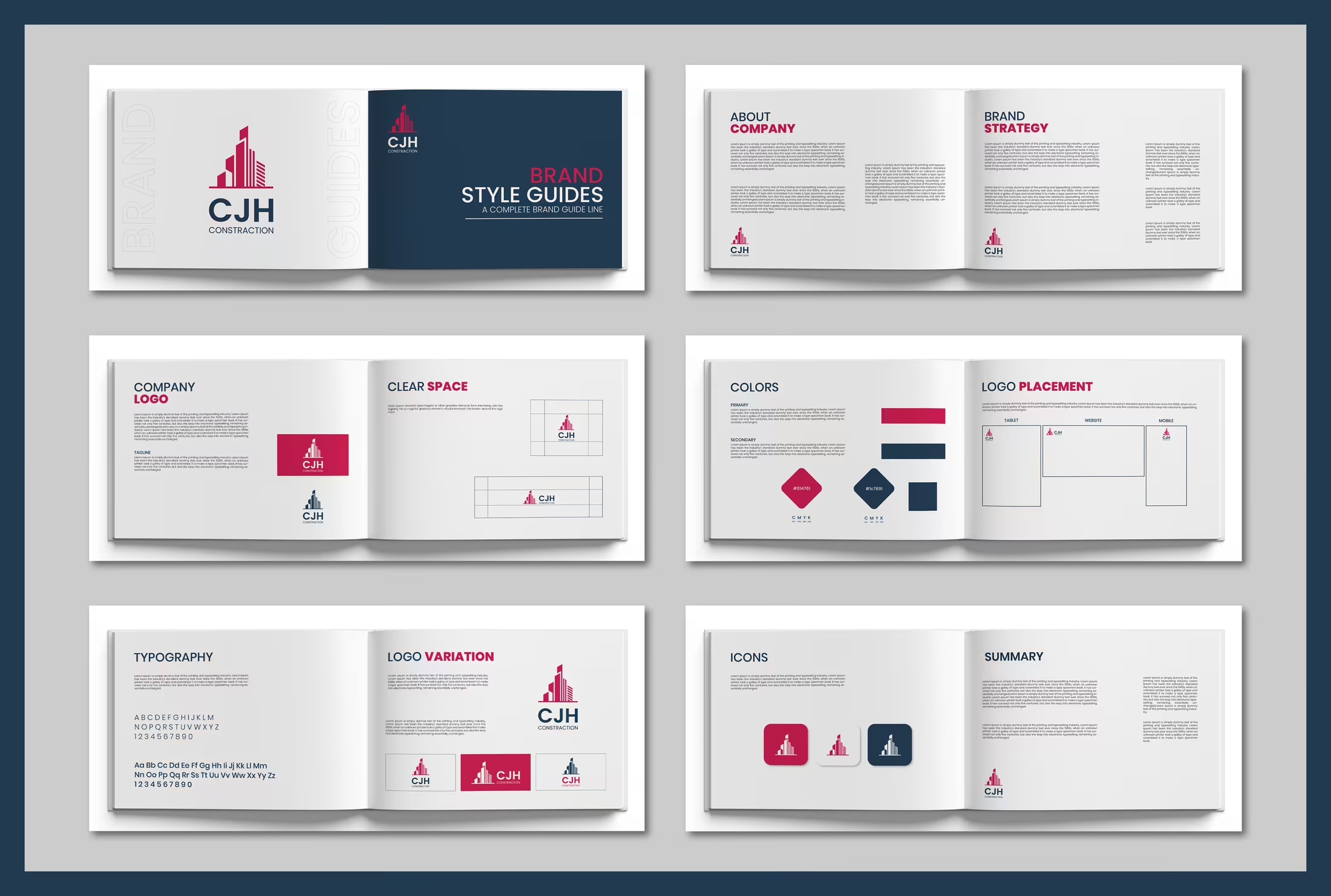
Style guide cover
The cover gives the identity a disciplined editorial frame, making the brand feel organized before the details even begin.
System spreads
Clear-space rules, color choices, logo variations, and icon usage all reinforce a practical, repeatable brand language.
Editorial presentation
The open guideline layout makes the brand feel more established, helping CJH communicate like a serious construction partner.
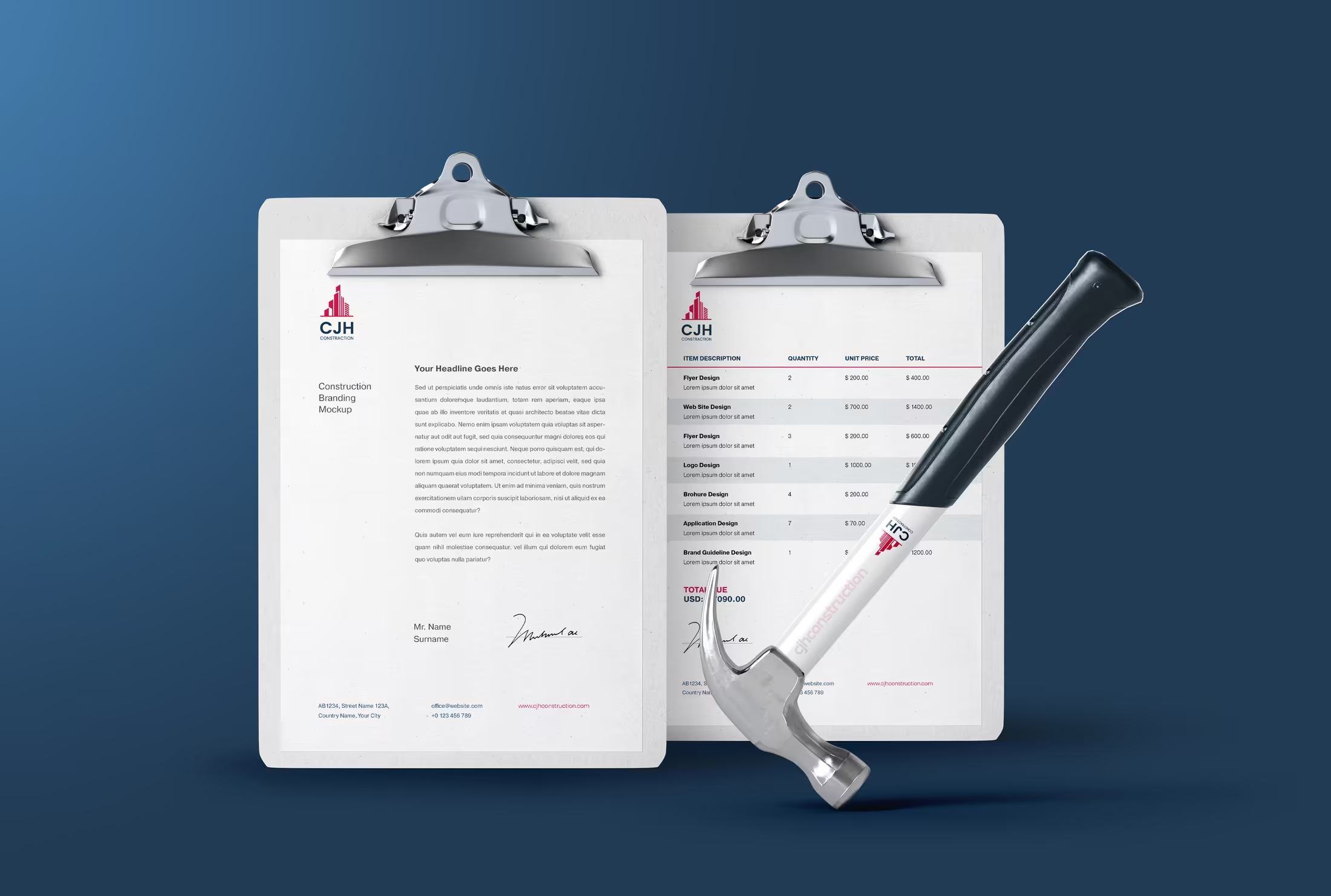
Application detail
The stationery and equipment composition shows how the identity stays clean in close-up product and print scenarios.
Field collateral
Clipboards, invoicing, and tools prove the brand can support internal workflows just as well as outward-facing materials.
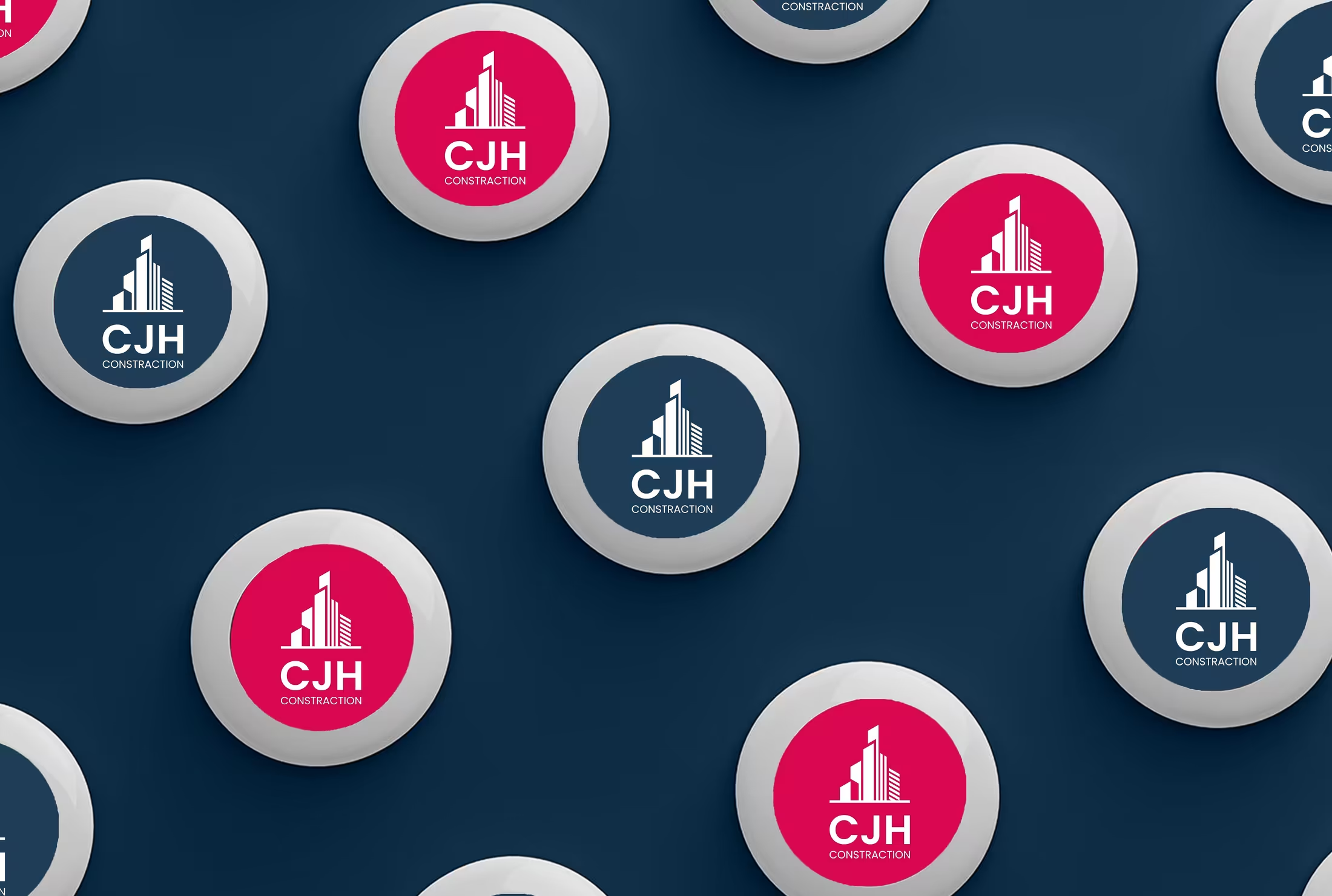
Branded repetition
The badge pattern demonstrates how the symbol scales into repeatable recognition assets for uniforms, giveaways, and signage.
Next step
Need a brand that looks credible in the office and on the job site?
We build logo and branding systems that are designed to carry real businesses, not just good-looking mockups. If you want that same clarity for your company, we can shape it together.